CQ Retrospective (Interlude 4 - Part 2)
Added 2021-06-03 03:43:19 +0000 UTCWelcome back! It's the end of Interlude 4.

I've mentioned before that for a long time, I was resistant to using pure white and black in my painting. Eventually, I got over this, and then I made up for lost time. I think this scene has a really good "morning light" feeling.

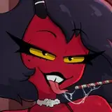
I feel like this must be the lightest the Nightmare Knight has ever been depicted in the comic. Even his speech bubble is darker than him here, but that's for legibility.

Obviously, the text here is green to indicate that Peridot is talking, but I think I could have made it fit into the palette of the scene a bit better by shifting it toward yellow.

This is another one of my "I don't have anything to say about this, just look at it" pages. The color palette isn't really cohesive, but it's a fun character interaction, so does it matter? (Yes.)

Silver Studios was originally (like, really early on) going to be part of a larger city that the heroes would visit. It had a futuristic vibe, which felt redundant with the Space Kingdom on the horizon.

Here are some sketches of the PP crew. The shirt would have been tough to make out in the actual comic, unfortunately.

The writing challenge here was finding a way for the Nightmare Knight to remain intimidating while getting his feelings hurt over a TV show. I leaned into him being tongue-in-cheek about it.

I'm glad I got over my pure-white phobia, because it really helped the lightning here. I do regret the confusing placement of speech bubbles in the last panel though.

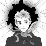
The fated return of Gary. I think the realistic rendering fell a bit short compared to his first appearance due to a lack of reference material, but I still think this sequence of panels is one of my favorites in the comic.

This is a reference to Pocahontas, if you weren't sure. Photorealistic rabbit joke aside, I think the worst part about Gary is seeing his lanky body exposed.

The bonus material in the published edition of Flower Kingdom states that the Guardener is "just some guy." That is, he's just a regular Dreamsider who was born with a photorealistic rabbit head for no reason in particular. He was never planned to be anything more than a one-off gag, but it's good that he made a friend.
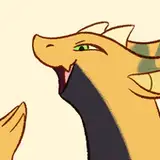
I'm not sure what's going on with Bacon's neck there.

Much better!
I'm really fond of the colors on this page. The sunset palette in the last two panels is pretty standard for CQ, but the blue foreground in panel 4 is eye-catching, I think.

The first panel here is especially unpolished, but I left it this way because it felt more energetic.
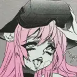
I remember there being a bit of confusion about this at the time, but Bacon is still named Bacon; Pancetta is just the name of the Pumice character. I didn't want to make an "announcement" about Bacon's gender on social media or anything, as I previously had with Rosemaster, since I ultimately thought it would be best to let the text speak for itself, but that did leave the issue of pronouns somewhat up in the air. So, for clarity's sake, Bacon uses "she" and "they".

I could have left the greyscale panel the same size as the previous, but I thought scaling it down slightly would better convey the feeling of "local dark lord gets upset for nothing."

So, originally, I was going to write out the scene where Cucumber returned to confront the wand cleaners, only to discover the mix-up was an honest mistake. There's even a thumbnail of one of those pages in my files, complete with dialogue:

I cut it because...well, it was boring, and it didn't add anything to the story. Reading the lead-up to this bit again, it definitely feels like I was setting up something grander, but...that was really all.

Here's a sketch version of the studio lobby. I wanted there to be some kind of Pumice mural running along the wall, but I couldn't get it to fit in a comfortable way without making the panel much bigger.

I really like the simplicity of the shading in this scene. It's a good "default" style for the comic, I think.

I had fully embraced cutting corners wherever I could by this point, so the first panel here reuses art from a previous scene, where I might have gone the extra mile and repainted it if this page had been done a few years earlier. (This would have been pointless! You know my webcomic philosophy by now, but once again: Cut corners!!)
I remember hearing that for some, this scene reinforced Cucumber and Nautilus as a potential ship. This wasn't intended by me, but I don't like to police how people ship my characters anymore, so I have no feelings about it.

On the topic of canon ships, though, here's the old favorite.
This might be the only time a character is shown covering their ears? It's a little hard to make out, partially because I couldn't rely on the familiar body language of a human covering their ears. Come to think of it, I may have actually sketched it that way in the thumbnail before thinking "wait a second."

It's just this short bit, but Almond acknowledging Carrot as "actually pretty tough" feels like a big character moment somehow. Also, I think it would have made sense to use Quakemaster's art style in the last panel, but I hadn't actually worked it out by this point.
Rereading this interlude, it's clear to me that my stamina was really flagging by this point... I did have fun, though.
Next time: possibly the last episode of this thing?! See you there!
Comments
thank you for these wonderful write ups :D
Capsule
2021-06-04 03:49:11 +0000 UTCI second this soooo much! I found CQ after it had already come out and binged it so fast. It's been lovely to read the retrospectives and incredibly educational.
Liz B-M
2021-06-03 18:25:26 +0000 UTCas someone who read CQ as it came out and also draws comics, these retrospectives have been an absolute treasure. thank you for putting them together!
BuddyGrouse
2021-06-03 15:06:11 +0000 UTCman I really loved this part...... especially the soft bit @ the beginning w NK and Parfait
2021-06-03 04:14:47 +0000 UTCbacon is the best
Bridget Coulter
2021-06-03 04:03:08 +0000 UTC