Watch on YouTube - or - Download
Hey!
Hope you're well! Here is the next installment in The Basics series - in this video I cover three different approaches to tackling a Spawn comic cover composition. I go over how I use shapes and directional lines as well as contrast in color, light and shape to create an interesting cover for a portrait cover, a more full character shot cover and a fight scene.
Here are the compositions -
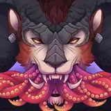
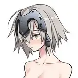
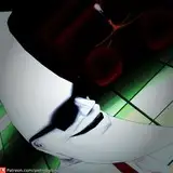
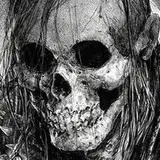
The Portrait -

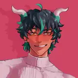
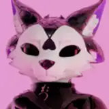
The Full Character Shot

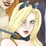
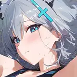
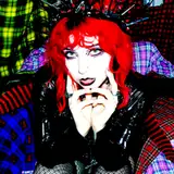
The Fight Scene

These three examples are just some of the approaches I would use when I begin work on a cover for a client like Marvel - the compositions themselves are entirely dependent on what they would need depicted on the cover but most of the time I'm asked to either do single characters or to create some kind of fight scene or dramatic moment.
Please let me know if there is anything more you'd like me to cover for compositions. I'm more than happy to help share my thoughts and process. I'm looking forward the next in The Basics series, these have been fun for me - if you have anything else you'd like me to cover outside of composition please let me know as well below.
Thanks as always for all your support!
Dave
by the way, this was the blog post on composition I referred to
Eugene Edge
2020-10-11 08:36:17 +0000 UTCBen LaCasse
2020-10-10 16:49:00 +0000 UTCLevail Naik
2020-10-09 23:11:56 +0000 UTCLouis Whitworth
2020-10-09 20:32:31 +0000 UTCOronoro
2020-10-09 18:55:31 +0000 UTCLucyan J. C. (cyangorilla)
2020-10-09 18:41:02 +0000 UTC