SamuKata
DaveRapoza
DaveRapoza

patreon


The Basics - Current Grayscale to Color Process + Brushes

Watch the video here! 

Hey!

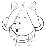
Hope you're well! Here is the first part of the Basics series for my current process using the Grayscale to Color technique using the ~ key for the painting in/out of values in black & white.  I also attached the brushes I use throughout the video as well as some others that I use during my process.

The second part of this will be the full rendering of the Pikachu demo - just had to redo the audio!

Thanks as always for your support!

Dave

The Basics - Current Grayscale to Color Process + Brushes

Comments

What happened to your "Green character theme" for your basics? This is COMPLETELY taking me out of learnings and I now do not know what to do with myself!

Ric Bülow

Hello Dave! (and everyone). I want to share my aproach to your awesome technique :D https://www.instagram.com/p/CZvQw-UOVvA/?utm_source=ig_web_copy_link

Daniel Franco Carmona

The grayscale is on a transparent layer not on white so you should be able to see through it

Gene Arvan

Yea I saw that but with both layer properties set to normal the color fill won’t show through. Did I miss something? It seems the greyscale layer above was set to “normal”

Asher Tail

its not ugly its a sexual being and its horny as fuck

Gene Arvan

fill looks like its going on its own layer under the value layer.

Gene Arvan

Thanks for this! I'm trying to follow along the part where you "fill in" but I must be missing something. When you select everything to fill, do you fill in the same layer as your value layer with a brush set to "normal?" Wouldn't that override the values? I can't seem to figure out this part.

Asher Tail

To everyone who's a bit uncomfortable doing this without placing the flat colors first here's a little tip. 1. Place flat colors 2. Duplicate flat colors layer and hide the first one 3. Create new layer with white fill and set blending mode to hue or saturation and merge down (This will make your flat colors to black and white value) 4. Create new layer on top and start rendering your shadows with blacks 5. Create new layer and start rendering your lights 6. Put the hidden (unhide it ofcourse) flat colors layer on top of everything and set blending mode to color. Right click this layer and click blending options. Look for the "blend if gray" option and adjust the scale of "this layer" by pressing Alt+leftclick and then adjust the dark and light to your liking. This will blend your colors to the black and white layers below much better. This will let you see the black and white value of the colors for some peace of mind lol. Locking the transparent pixels will also let you just select one base color and only work on that area to make rendering a bit easier. Sorry if this is just confusing but I hope this helps some people!

Ralph Ballesteros

ah, it also only works if your keyboard is set to English US. I just upgraded my PS to CC2022 and its still like this. :')

Paula Shin

two things about the ~ for erasing 1. this is a new-ish feature, implemented from PS CC 2020 forward. if ur photoshop is cc2019 or anything below, it doesnt work. 2. it ONLY WORKS if your keyboard is set to "English US" if its english international or any other keyboard layout, it wont work. (at least in windows, dont know how it works on mac)

Paula Shin

We should come up with a new name for "piece". I tend to refer to everything as a project, especially when I do more than one that has a similar vibe I can just pretend like it happened on purpose. I also used "I got this new jam I been working on" the other day, its probably equally pretentious but nobody questioned me on it.

John

most of it can be replicated in Procreate for sure. The color correction part not really because Procreate doesn't have selective color adjustment and advanced correction tools like that.

Alfred Manzano

Hey Wero, it's in your Wacom Desktop Center

Alfred Manzano

(it's just my opinion) I found the drawing ugly, a random rabbit, I preferred a portrait

Fhilippe124

This was really interesting and helpful! Can't wait for the Pokémon thingy! <3 How would you approach introducing a strong secondary light source I.E. from the bottom left? Like a blue light for example. Would you try to figure it out in the BW stage or would you introduce it at the end?

seothis

Anyone knows if this technique can be implemented in Procreate?

Eugene Edge

I loved this! Can't wait to try it out!

Paula Shin

so I did some digging and this is a new feature, implemented from PS CC 2020 forward. I use the 2019 version so it wasn't working for me as well. But from what I've seen, its a default shortcut on 2020, you dont even need to set it up.

Paula Shin

I have the same question, dont have that key on my keyboard?? anyone know the name of the shortcut on the menus?? thanks!

Wero Gallo

Hi Andrew! where you see/change that settings?? thanks in advance! =D

Wero Gallo

I was also wondering this, I might have to go and see if he did or not haha

Tj Williamson

I'm following along with this video and just discovered why I was getting such dark values when using the hard round technique. Wacom "Tip Feel" , heh, was set too soft. I set to one tick closer to firm from the middle. Noticed a huge difference right away. I'm using an Intuos4 so probably a little dated on the pressure sensitivity. Great video so far!

Andrew Glassman Art

Hey Dave this is really helpful thank you! Sorry if you have already explained this but how do you configure the ~ for erasing technique?

Antar Castro

appreciate this Dave! I know for me I avoided grayscale to color processes because of never getting my colors set easily, it was always so much added work I felt like. seeing especially in the chrono trigger "piece" how you mesh your shading in with the flat colors, really clicked something in my brain. I'm currently working on a painting now where I am trying this whole approach. also cool tip at the end adding some noise!

Alfred Manzano


More Creators