That was a bit challenging)
For the first time, I've tried to use a lot of references and even made a board with screenshots from "Nemestice" trailer so I can understand how my work should look like to be close to a trailer. This was the beginning of new techniques I now use for posters (and animations).
The first poster had multiple lighting iterations you can see in the first screenshot above. The first iteration looked good to me and even had a feel like it was a frame from some cinematic. But it was missing something... like, lighting was great for animation, not for a poster. And then I compared it with trailer screenshots... I can't describe how different and worse it was. With this in mind, I deleted old lighting and created a new one, but this time I used references from a trailer. This helped a bit, but the poster still was far away from that Dota feeling. But at least, it was a lot better than before.
"Hmm. looks great but this is not close to what I want" After these words, I saved old lighting and began making new one, this time trying to copy lighting from a trailer. And I failed, it looked a lot worse than the previous, way too yellowish and the colors were off... Deleted and began making lighting again.
This time I succeded... almost, I really enjoy how it looks but it is still far away from trailer screenshots. Thinking that there was no room for enhancements in lighting, I stopped here. Now it was time to get something I hadn't really used for a long time - Color correcting in Photoshop. Can't say that this was my first attempt to color-correct something but I never used the tools I use now.
Few guides on YouTube on how to use new tools and I was ready to begin editing the poster in Photoshop. The first thing I discovered is that my poster looks way too saturated compared to a trailer. Tbh, this feels really weird, I always try to make my posters/animations vibrant and saturated and now I need to do the opposite. Second, I still don't fully understand how to make it look like a trailer but this will go with experience.
Now with all these weird corrections, it looks awesome. It even got to the point that if you look from far on the poster, you can think that it's a 2D not 3D image, which is awesome.
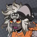
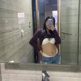
The second poster was by far the most challenging poster of these 3. The view angle was tricky, it required specific "tricks" so everything worked. Adding liquids was a problem too as there is a VERY thin boundary between "It's way too much" and "It's way too little". Making liquids in 3D is always a big trouble. I know only a few artists who make them look great. Thus as I work in EEVEE engine which doesn't have critical features, it makes work a lot harder. There were 2 iterations of them, the first one is not included in the post, and the second one you can see in the final work.
Now to the lighting, as in the previous poster, it had multiple iterations of lighting. Same problems as before, but now we had a view angle from below where... no great light sources. When the view angle is above, there are a lot of light sources possible - sun, sky, reflected light, etc. When the view is from below, you have only a bit of the sun and reflected from ground lights. This is a moment where you should stop creating "realistic and logical" lighting and go mad with stylistic lights. In the second poster, I made half-realistic lighting, why "half"? Because you have a second sun looking in another direction from the first sun. Not logical but made poster look good which is usually more important than realism.
Now to the hardcore part of it. As in the previous poster, I should have made it look like a dota but this was not important as a different thing, I needed to make it have the same or similar colors as in the previous poster. There were A LOT of tries, only some of them got on 2nd screenshot in the post. Gladly, I ended up with more or less similar colors.
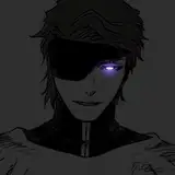
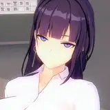
Now to the third poster, easy and complicated at the same time. As the trap was hidden in leaves, when it was activated and trapped Hoodwink, you can see falling leaves from trap activation. In 1st poster it didn't make any problems, just add a cube with a particle system that uses leaves instead of spheres and you are ready to go. Same with the leaves on the ground. Now in the third poster, as all leaves are on the ground with Hoodwink. I needed to make ropes which isn't tied her be covered in leaves. I found better leaf texture and manually covered ropes in the most important places.
I had a bit of a problem with making her look like she fell, but eventually, it was solved. Funnily enough but rope on her made her body look a lot better, it hid the weird proportions of 2nd model. I always try to hide this problem and usually, it makes her look a lot better.
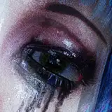
For the lighting, there is a weird situation - the lighting was created by an accident. To make it look like she was fucked for a long time, I made 3rd poster have a different time of the day. And well... I just added sun and "ambient" light and it looked really good. It was so good and had a very close to Dota 2 feel, so I decided to leave it. Sadly this lighting made it different from the previous 2 posters. But on the other side, it has a totally different feel to it.
Then color correct hit hard, like really hard. From just good looking poster, it made it perfect. And even close to the other 2 posters.
In conclusion, I left with great experience and now I'll use Photoshop more often. And what's more important, the commissioner (if it's the right name for those who commission me :/) left with really good experience and 3 great posters. Thank you!
sotoco
2023-10-21 20:44:39 +0000 UTC