For today I thought I'd give some scattered thoughts on character design you may or may not find interesting. I've been working on it a lot this year, trying to come up with a good thesis for the perfect method of doing it, but for the most part what I've learned is that character design is a skill, just like any other, which just takes learning and practice.
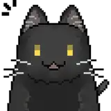
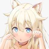
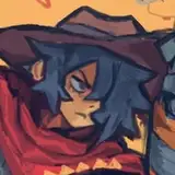
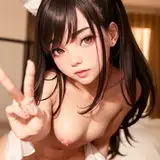
This Character:
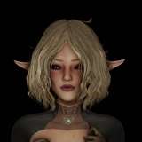
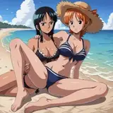
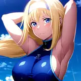
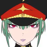
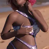
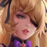
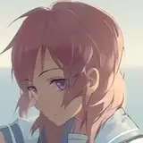
Above you can see a planned character for VT I made a couple days ago. I've been trying out a new process where I use a low transparency color brush to build the character and add texture and shading as I work, and I have to say I really like the results. I always take it as a good sign when something makes my work look more like what I see professionals do, and this messy way of concepting definitely feels like a step in the right direction.
For me, character design is more about problem solving than creativity. Once I get an idea, I generally have a list of elements that I want to implement, and the design process is solely about figuring out a way to work in everything. For the above, my list was: Tiger girl, Nicole (ZZZ), qi pao, martial artist, slim. Most of those work well naturally, but she also needs to look flashy in a tacky kind of way and streetwise while retaining the other elements, which is the fun part. I think adding disparate elements like this is always interesting.
By the way, I'm sure you can see her inspiration pretty clearly on her now. If you've ever tried making an OC and got discouraged because you felt like you were just ripping off the things you like, that's what character design is! Humans can't consciously create something from nothing, but we're great at combining things in new ways. If you've created a design that you feel is too close to an existing one, just add on a few more elements or inspirations to their formula until they have become obviously distinct. The characters you're taking inspiration from were made in the same way!
Inconsistent Exaggeration:
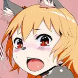
As part of trying to make my artstyle look as anime as possible, I've been trying to figure out what it is that makes something look "anime" versus western, cartoony, etc. I think a big part of it is that anime tends to have inconsistent stylization. What I mean by that is, when you look at most non-anime art, characters tend to be either stylized or realistic from head to toe. The ones with cartoony heads have cartoony bodies, the ones with realistic heads have realistic bodies.
However, what you see in anime styles is that characters will generally have fairly realistic bodies and then highly stylized heads. If you look at this character, sure her body is obviously exaggerated, but her head is positively inhuman. And I think that philosophy extends to designs as well. Her outfit may be fairly consistent in style, but then we just have a giant buckle on her fanny pack or a big weird button on her coat that say, "Look, this is fantasy! It's fun!"
Core, Supplements, and Embellishments:
This is a way I have been breaking down designs into stages, to make it easier to figure out if the character I'm making is interesting enough.
The core of your design is your character. What's the character we're working with? Right, tiger girl, qi pao, big jacket, mini shorts, slim body, smug face, twintail buns. As long as this character has those things, they will look like this character. Changing anything outside of those elements will not greatly change the impression the character gives off.
Supplements are added next. They aren't necessary, but they reinforce the idea of the character, add detail where it's wanted, and break up the design. Her fanny pack, mismatched stockings, or big sunglasses are examples of these supplementary elements.
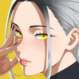
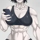
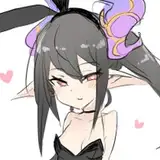
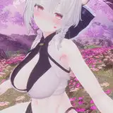
Embellishments are the final layer. These are elements that aren't necessary, don't reinforce the idea of the character, don't add much detail, and don't really even break up the design. They do, however, make it look fancier. To show you what I'm talking about, here's a popular video game character with and without the embellishments.

At a glance she's basically unchanged, but all the non-structural lines on her jacket, the large metal logo, the writing on her belts, the pattern on her tail, and the non-functional belts and zippers on her shorts are all what I would consider to be embellishments. They don't really change her design or have any reasonable function, they just look nice!
To be fair, a character never needs to go beyond the core layer, but because this is a gacha game we want to get as much value as possible into every image because that one image will have to sell the whole character. These classifications are useful, because as I'm designing a character I can now go, "Oh, have I added enough supplemental parts? Where can I place some embellishments?"
Anyway, development on VT is proceeding well! Now that I'm helping on Venus Derby I have the pleasure of working with a more experienced programmer, which is fantastic for me and is letting me learn a lot, but which also means I've been spending a fair amount of time figuring out ways to work what I've learned into VT. Thank you so much for all of your support, and chinese fans please recommend good chinese "container" names that would fit a tiger girl.
Wallace James
2025-09-09 11:38:06 +0000 UTCKoimanZX
2025-09-09 08:32:09 +0000 UTC