SamuKata
alexries
alexries

patreon


Book Cover Tests - HQ

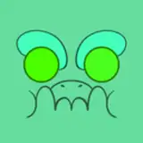
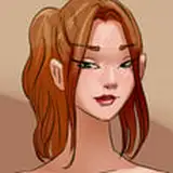
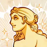
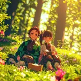
Some high resolution cover explorations: these are part of the big pitch package I am putting together! Will only release them here and to select confidants. See what you think!

NOTE: The image is unlikely to be final: I will have LOTS more art as the book nears completion to choose from!

Book Cover Tests - HQ

Comments

I think you might be right. I will see if I can make the white background work with the sisters...

Alex

Yeah broad agreement seems to be on E

Alex

I think you go with D, E, F. And of those E is the most captivating. HOWEVER: I think you should do D or F with an alien background.

Jake Parker

I like the style of A, but an image like E. I think "The Birren" rather than "Two Sky River" as the main title is better, as it is clearer it is not about a place on Earth. Similarly, a picture of the Birren themselves rather than their technology makes it clear it's about alien life, not future Earth (well, not directly about future Earth :)). I like the two sisters in everyday life rather than the more 'staged' portrait of the Birren and Giant.

My only choice is E. The others are fine, but E is the only one showing a birrin's-eye-view of the people in their environment. The two of the birrin on a white background hearken to Barlowe's Guide — not a bad callback if that’s what you’re after.

Its true, planes are too generic

Alex

I like E and F the most, if it's a book about aliens it should have aliens on the cover to convey that.

On first view, my eye went to E. Seemed to illustrate the pitch of the narrative, and feels active. The left to right motion sets me up to start reading an exciting story somehow. But any of the covers are something I would be drawn to if I saw it online or at a store.

Stephen Somers

I'm torn between E and C. E as it features the sisters, and C as it's a bit more dramatic.

John

Shut up and take my money? ;)... Personally I think the "E" cover have the greatest appeal to me because it leaves no doubt about this being an alien planet (B and C could be "Earth" if you just caught a casual glimpse), D and F doesn't have the activity that grabs my attention in E. That being said, I would buy any of them ;)...

evengill

From those, B is by far the favorite with the pleasing sand orange mixed with the flying creatures, in addition having a good view of the context giving river valley

Astro-Aladfar

My top three favorites from the first to the third are B, A and E.

Astro-Aladfar

Ah well, lets hope it happens. I have good friends with experience helping me pitch it, but a long road yet! But I will keep working until its done.

Alex

I think you might be right...

Alex

I do like the white, might see if i can combine it with the birrin themselves?

Alex

A looks nice with the white. The bottom 3 give the interest of aliens, E because it could contrast the white. Plus I don’t think there are many books discussing tribal level aliens, with the spear fishing and seemingly not much tech. B onwards have that rustic/old feel, its out in the wild with old things, dry dirt and sand too. They all look so good!

ZCochraine!%

Loving them, getting me very hyped for the release of the book! I think my favourite is the bottom middle and right. As awesome as the plane designs are, I think it’d be a shame not to have the unique design of the creature on the front. Plane on the back cover for sure though!

Samuel Thompson

I can't believe this is happening! I'm so excited for you, and I cannot WAIT to get my hands on a copy of the book. Personally, I really like E as the best option for a cover, with C as a second choice.

Andrew K


More Creators