Designing Mod Art to Match a Pre-Existing Style
Added 2021-08-18 06:42:51 +0000 UTCToday, we'll talk a little bit about how we replicated the art of RimWorld's storytellers for SOS. Allegra has written a really cool guide for how she approaches replicating an established style and doing justice to the original author's work.
[Allegra]
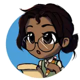
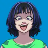
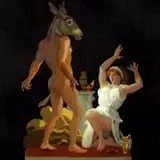
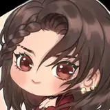
The first step to creating new pieces for a project is to give credit where it’s due - the original artists. Their remarkable hard work and design choices are something to be admired. In this case, we have game artist Richardo Tomé, who worked with Ludeon Studios to bring the following portraits to life.

Analyzation skills will only take you so far, though. Having your own personal experience and areas of expertise is irreplaceable. Master studies are a common practice in the scholarly fields of art and are something that I still find extremely useful. The art of replication comes from dutiful duplications paired with long hours of study. Once you have enough involvement under your belt and feel confident in your abilities to compliment existing work, you’re all set.
As far as technicalities go, every creative has their own way of dissecting a piece. For me, proportions and ratios are one of the biggest things to pay attention to. Your lineart and color can be beautiful, but if your proportions don’t match the existing project, it’s simple to spot.
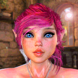
While tailoring Sara Spacer to her new home, I found it was important to consistently go back and check the scale of features that the eyes are most drawn to. Negative space also plays quite a large role in how “out-of-place” your work will look in a set. The posing and positioning is something to keep in mind as well, especially if the content you’re creating will have cropped alternatives.
Paying attention to the depth of detail a piece has is also important, in this case, how many layers are worn in the costume design. You don’t want your piece to look too plain or too cluttered, so plan accordingly and pick something that speaks about your content - Sara Spacer is donning an orange and white patterned suit, which on its own, can be quite nice. But she looked a little underdressed compared to the other Storytellers - and imaging her to be practical and tactical, I gave her an olive overcoat. This also helps add some detail to the silhouette.
If you are still unsure of how things look in a lineup, Either do a silhouette mockup or simplified greyscale and see how they look comparatively. A second pair of eyes also can be useful at this point.

After having an approved sketch, the first thing I like to tackle is linework. For this design I created my own brush to best replicate the effects and pull of the original. Line placement is a process you don’t want to skimp on. You want to observe where the other artist places down their details in specific areas to make sure your piece fits neatly in the set. Reference is key, and you can never have too much feedback.
Once your linework is complete, the next step is usually color. I took the liberty of making an entire palette of possibilities which helps eliminate any guesswork.

Each existing character has their own column and groupings for aspects like hair, skin, and clothes. There you can get a feel for where things sit, saturation and value wise, and make your own colors from those observations. The topmost line is my base reference for Sara. Having a lineup like this helps you tie together common color usages and see patterns that could otherwise be looked past. The original creator chose colors that perfectly complemented each individual across the board, creating a sense of unity.
After you have settled on a palette, it’s time to get working! I like to block in solid colors, beginning with the darkest and working my way up to the highlights. Light placement is also key here, you don’t want dramatic shadows that aren’t present anywhere else. According to the pieces you’re working on and what style the project is already using, you’ll go with shading to match that. Hard edges vs soft, concave vs convex, straight vs curved, that sort of thing. Having experience with studying different materials will come in handy here.
When you’re all done, do a final lineup to see how the different pieces fit together. You may need to make adjustments here and there, but that’s part of the process! Happy modding!
[Thain]
Adding anything to an existing IP is tough. Sometimes that Intellectual Property is just done, a completed work, and adding something just takes away from it.
Other times, a game much more open to added experiences, like RimWorld, it's possible to fit something in or wildly bolt on another complete module, and your biggest hurdle to doing that is just making it feel seamless.
SOS is very much about taking the existing mechanics and letting them play out in a radically different setting with mechanics that are alien to the base product, and as a consequence, simple things like a caravan walking in from the edge of the map, an extreamly common and persistent method in the game for delivering content, actually disrupts the experience of being in space.
Everybody who is familiar with the base product knows Randy Random is the guy. Players love and hate him, he's the chaos god of mischief, and randomly throws events at the player. Some of those events are added by other mods, which we can't anticipate. Kent was able to fix Randy himself, but storytellers based on him, will wreck our space map with these random caravans or raids walking into the edge of the map.
So we needed a Storyteller who could prevent that, and still offer an interesting experience and personality of their own.
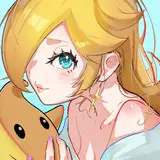
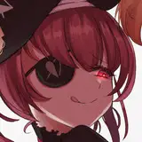
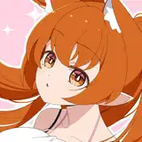
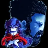
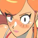
That's why I asked Allegra to make Sara Spacer.

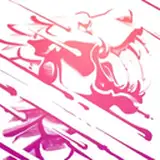
We went though just one draft based on my pitch, and started to refine her details. In the above animation you can see the progress.
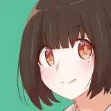
Initial sketch and color:

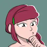
Refinements to iterate on those themes:

And the collage of comparisons to the existing art:

If we're going to have an awesome storyteller, we need an awesome background. It would be a good way to introduce the character and have it feel like SOS is finally "complete" as a package bolted onto RimWorld in a way that's seamless.
So I set to work looking at the base game's art, and figuring out how best to replicate Vanilla's feel with our own unique take.
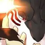
The base game has several DLC backgrounds, the original and the Royalty dlc, that feature wrecked star ships.
SOS is all about wreckage of star ships!


I chose to make our ship the Glitterworld Planetkiller, originally by (Insert Boi Here), one of our shipwrights who made it as a pack of ships in the SOSCK.
It's a user submitted ship with a great silhouette, show off our community's creativity and generosity, and it has the qualities to fit on a great image.

I already had the SOS logo planet render to pull from in my library, made 2 yeas ago. So I started looking at Royalty & ideology and our own planet, and as Sara took shape, added her to a quick slapcomp to look for composition ideas.

Sara slapped onto Royalty.

I identified a rough shape and a vibe to go for. 2 moons, a planet behind, a blue glow from the planet behind the character, and the majority of the image is starfield.
After borrowing elements again from the master Richardo Tomé, I did paint overs of the Royalty ship and the vanilla Colony Ship, instantly recognizable to players, and added those to the scene, with similar lighting to the originals.
After adding ship layers, we decided as a team to keep to the SOS themes of RGB (red, green, blue) which color code our in-game weapons. The bright green plasma at the top fits with the bright planet, and the darker red fits with the abyss below it.
I applied several filters to my planet to get a rich creamy feeling to the texture, rather than the hard normal & shadows, to better match Allegra's art, and let Sara stand out as the most detailed focal point.

Overall, it fits the original themes and ideas of the existing base product, and ties in neatly.
Feedback so far says we achieved it, which is very cool to hear.