Thoughts!
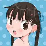
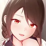
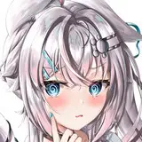
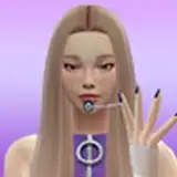
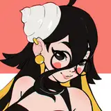
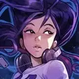
1. I didn’t want to do this practice, but the snake looked cute. Besides, there were plenty of colours on her face, and the little skin hat had an interesting reflection and texture.

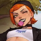
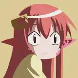
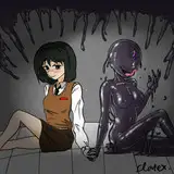
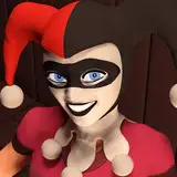
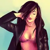
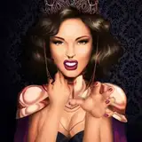
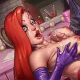
2. I wanted to see how many reactions a suffering portrait would get. There weren’t as many as I thought, but I still had fun playing with colours and brush textures, just to make the skin feel a bit less simple.

3. The original photo of the church really had an atmosphere—partly created by the light and the fog in the background. Also, that roof was definitely strange. I liked it, but I think I didn’t add much extra value; the picture was already unusual. It’s one of those photos that doesn’t really need an artistic touch because it’s interesting by itself. Nevertheless, I wanted to paint a nice church.

4. The dog was an extra I wanted to add to the series. It didn’t take too much time, and I thought it would be funny to find this casual fellow in the middle of my practices.

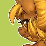
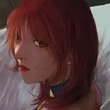
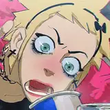
5. The chicken on the swing—again, one of those random pictures I save for no reason. I just like them. Luckily, as a practice, it had plenty of colours to work with, using different brushes. I guess I’m really into colouring pictures lately, pushing them a bit further from their original look.
The trick for these kinds of practices, I think, is to think of grey shadow tones as cold ones—blue, green, purple. And for the bright spots, choose the colour you see but push the saturation a bit. To keep balance, just don’t make both sides (shadows and light) equally saturated. For shadows, choose a cold tone close to grey.
Does that make sense?

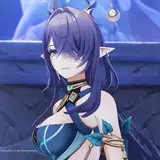
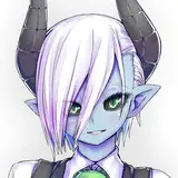
6. This statue, compared to the ones I’ve done lately, is a bit more stylised. By that, I mean I chose to use long, clean lines to summarise a sequence of different anatomical silhouette shapes. For example, look at the nose in the practice versus the nose in the reference (you’ll find the reference on the Pinterest board). I tried to make the values as realistic and complex as I could, and balanced that realism with a simplified silhouette of the body (style).

7. Finally, it had been a while since I’d done a little architectural practice. This time, I liked the light and colours in the reference, so I kept the line art very simple and chose to spend most of the time playing around with the watercolour brush and the wide range of blues.

Process Video: https://youtu.be/7OENzkLcD48
.
Guys!, here is how to get your free Patreon print with the book
As a Patreon supporter, you can get an exclusive art print for free when you buy my book next week!
The campaign launches on Tuesday, 8 April at 4 PM BST.
To access the special Patreon-only reward tiers, make sure:
You have a Kickstarter account and you're signed in.
You open the link from a browser (desktop or mobile).
Secret rewards do not show up in the Kickstarter app.
There are two options:
Signed book + exclusive print:
https://www.kickstarter.com/projects/1906838062/the-art-of-ramonn90?secret_reward_token=5629261e
Unsigned book + exclusive print:
https://www.kickstarter.com/projects/1906838062/the-art-of-ramonn90?secret_reward_token=89737f38
Quantities of signed books for the public will be limited, but your Patreon tier has no limit for now, so if you want one—get in early!
Let me know if you have any issues, and thank you for your support!.