Here are some insights from past practices:
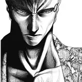
Hand
I liked how the hand in the reference reminded me of hand designs by other artists. I found this very stylised way of drawing knuckles and finger bones interesting, so I wanted to give it a try. The contrast in the skin also posed a good rendering challenge. My approach for such an intricate surface full of detail was to focus on the big shapes first—not the folds or veins. Those came only at the end; otherwise, the overall shape might end up looking flat, just filled with tiny details.

.
Dallol, Ethiopia
What an unusual place. The colours were the reason I chose this reference. I interpreted the shapes—like the silhouettes of the rocks, the water patterns, and the distant mountains (very faintly). The photo was already surreal, so I can’t take much credit for that.

.
Japanese Pancakes
This was a quick but useful practice for sharpening the eye. There were subtle changes in the surface where the darker tones shifted to brighter ones, no hard edges—just highlights leaning towards purple, especially on top of the syrup. I enjoy doing these kinds of practices because of their simplicity—and because I love pancakes. I regret not adding a cute little face at the end—I just forgot.

.
Onion
At first, I didn’t realise this was an onion. The colours and silhouette were enough to make me want to try it. It looked simple at the base but complex at the top. While painting the green parts, I saw desaturated areas in the leaves as a chance to try some purple tones. The textured brush I often use, called "Cater", was great for those complex silhouette shapes. This time, I didn’t forget the little face.

.
Bonaventure Cemetery
This statue—an angel, I believe—is located in Bonaventure Cemetery, Savannah, Georgia. This isn’t the first time I’ve painted it. I just love the texture, the sculpted shapes, and the shadows they cast. The top-view lighting creates a nice contrast, and in this case, there’s also a light source from below, where the shadow is faint and soft. The values were a bit complex here. These practices are a feast for texture. It seems no brush is the wrong choice, since the surface is so rustic. What matters is to have clear value distribution, then use brushes to smooth the transition between light and shadow.

.
Blue City
Although this picture looks edited, I still liked it enough to paint it. I’ve noticed how colour-driven my choices have become lately. I think the value in my work isn’t just in the painting but in the decisions I make about what to paint. Those decisions aren’t always clear, but there are a few consistent criteria: I need to feel something first, then I look for interesting shapes—whether in silhouette or value—and of course, colour. I’m not sure if that’s the right order; it probably shifts depending on what stands out most in the reference. But generally, I tend to choose images with those traits. Why is this useful? I guess you’re here because you feel drawn to what I do. Understanding why I choose these pictures might help you sharpen your own eye when deciding what to practise.

Process Video: https://youtu.be/GA00CGXsLwM
Brushes: https://drive.google.com/drive/folders/1wHu8wuEHjDk-VfnZqv8iy8rwnvu8Ngmj?usp=sharing
.
Hey!, you can now pre-order my book Life in Every Sketch on the 3DTotal shop.
https://rebrand.ly/The-Art-of-RamonN90

Please let me know if you have any questions—I’ll be happy to help with art advice or book details.
Ramon Nuñez
2025-06-07 04:57:05 +0000 UTCDaniel Ubechu
2025-06-07 01:34:53 +0000 UTC