Hey everybody, some straightforward thoughts about my latest processes.
Eggplant
Just a casual fun warm-up where I struggle a bit with light reflection on the eggplant's smooth surface. I chose main light top-left, reflected light almost same tone. Struggle: deciding light position and hard light/shadow edges on naturally soft form. Video shows me changing my mind a few times before refining. (Missed hitting record for final polish.) Key value: practice defining hard-edged shadows/lights on smooth objects. A bit tricky, I guess try it with similar materials to stylize lighting.

Boy and Cat (Cleaning a Boat)
This reference felt perfect, a bit complex but interesting to look at. First time trying such a large-scale composition in a social media post; in the past I'd probably hesitate, but now I'm trying anything I find interesting, regardless if experience says it'll reach big audiences or not. Technically, check the video for how I simplify complex shapes in layers, with small adjustments to fit post formats. But more than that, the value's in trying new things just because you can. It opens doors to opportunities you didn't contemplate, not just technical but themes outside your comfort zone. Also, sometimes it's fun.

Fan
I'm a fan of this fan practice. Can't explain why, but I really liked the result. I think it's because it's complex and simple at the same time. Palette has variations of one tone (green), which I like most in photography: one-color shots, similar to Guillermo del Toro's movies. Perspective was very distinctive with two vanishing points, often used in concept art. Finally, how casual the subject was, just a simple fan. Often I need to push complex subjects into simple ones, or simple into complex; this had a bit of both and I completed it in almost 1h. Perfect. For you to take in here is basically a set of points I found interesting in a piece of work, whether it's concept art, an illustration or simply a practice study.

Oranges
A casual plate of sliced oranges. What I liked about this picture was the bright colors and how light passes through some slices, making its value boost the saturation of the orange inside. The good to take in here is how you can create vibrancy by combining saturated bright tones, not in every part of the shape (the orange slices) but only where the light is positioned, leaving very small strokes of white tones near the darkest desaturated spots, thus creating contrast and boosting the texture.

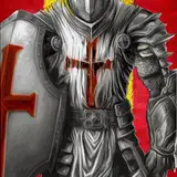
Knight and Horse
This is what I call a good challenge. Following the perspective from my previous "Boy and Cat" practice, I chose an even wider subject with two characters. The horse needed a clear personality, captured through eyes and eyebrows. Due to its fur, I thought it made sense to make him dark or tenebrous with very dark shadow tones, something I rarely do. For the woman, I went with a redhead which I thought would match the theme; perhaps a man like in the reference would make more sense, but it's been a while since I painted a female redhead. I wanted to use the hair shape to break the silhouette, making it more interesting to look at, as well as playing with armor reflections; this material seems quite attractive for people, based on my experience. The thing to take from here is the combination of pieces I brought into the original reference to make this practice a bit more interesting to my taste.

Bathroom
Lastly, a greenish casual environment; who hasn't been in a bathroom? I like the mood. I'm a fan of The Matrix series and part of it I believe is that green filter some shots have. For you to take in here is my drawing process: organic strokes, trying to guess shape positions with perspective applied, then using the brush for adjustments. At the end, color application was very straightforward and values simple as well, with a casual top light. I eventually ended up adding more tones than the reference had, including some variations of pink and purple right in the light, just like the original reference slightly had.

Practices 54 & 55 Process Video: https://youtu.be/HzoQ1rKkG-E
Brushes: https://drive.google.com/drive/folders/1wHu8wuEHjDk-VfnZqv8iy8rwnvu8Ngmj?usp=sharing
Pre-order my book Life in Every Sketch on the 3DTotal shop: https://rebrand.ly/The-Art-of-RamonN90

Please let me know if you have any questions!
.
Quick Pinterest update. I'm currently searching for a Pinterest replacement due to its lack of efficiency in addressing my issue. I don't think they'll do anything anytime soon, but we can't wait! I hate to waste time, so next week I'll announce a new platform for this particular tool so useful to us: for me to share curated inspiration and for you to practice. Thank you for your patience.