Some practical ideas behind these studies.
Colorful Shore
While I slowly seem to turn to simpler shapes, I balance by choosing colorfully interesting compositions. This reference is very bright. At first sight, you notice blue and brown, but closer inspection reveals subtle tones within the cold range, like purple in the water or green in the shadows, as well as very small warm tones, like yellow with a bit of orange, almost red, within the skin. I figured that by saturating these colors, I could create something different from the reference. How can you notice these colors in nature? Take pictures where sunlight is bright and shines on reflective materials, like water or metal. These tend to mirror the world and capture a portion of it in a small space.

.
Dark Singer
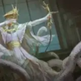
From this reference, I liked how red, white, and black were balanced within a character with a certain perspective, showing her hand while having an intense facial expression. It was simple but very harmonious, in my opinion. I thought this red practice would create high contrast compared to the previous practice. The tone felt dark and serious. For me, it’s important to balance artwork with contrast, whether it’s black and white or colors. I find paintings boring when all values blend with almost no protagonist.

.
Sharp Milk
The challenge was making something simple look different, not just a boring copy of a glass of milk, but boosting reflections through dark blues and highlights, while defining smooth tones with sharp, hard-edge values. The textures on these edges were the final touch. It’s often the casual, simple references I enjoy playing with the most.

.
Pasta!
I love painting people eating, as well as painting food, so this reference was a yes, a very casual moment of eating pasta. During this practice, I aimed to keep the face very simple yet maintain intricacy in the sweater through textured shadows. This combination allows me to keep the face style consistent across all my characters while adding an attractive, somewhat realistic render. Maybe in the future, I’ll go fully flat, but I want this transition to simplicity to smartly retain a three-dimensional illusion. I’m just not sure how yet.

.
Chill Koala
This was a vibe. Once I saw the reference, a little smirk on my face signaled, “Yes, I’ll like painting this little guy.” I choose references that make me feel nice in some way, maybe the colors, values, or textures. For this type, I’m mostly in for the gesture, a relaxed, strange creature. Plus, the tree’s shape is interesting for a composition.

.
Alive Olives
A jar with a simple silhouette shape, but the real value in this practice was making something interesting from a picture with no crazy textures or complex lighting. I started with no idea what to do, but while painting the holes in the olives, the idea of “zombies” popped into my head, silly, I know, but a bit funny, as it looked like the olives were screaming. From that point, I figured it would be an interesting direction, so I added small details here and there to suggest that concept, like the labels. As an extra touch, I added circular shadows where the olives touched the glass. These weren’t in the reference, but I figured they would push the idea of them squeezing each other.

.
Practice 58/59 Process Video: https://youtu.be/nc7gH_Tysbo
Brushes: https://drive.google.com/drive/folders/1wHu8wuEHjDk-VfnZqv8iy8rwnvu8Ngmj?usp=sharing

Pre-order my book Life in Every Sketch on the 3DTotal shop: https://rebrand.ly/The-Art-of-RamonN90

Please let me know if you have any questions!
Ramon Nuñez
2025-10-06 09:06:20 +0000 UTCShanti Brown3
2025-10-05 22:53:40 +0000 UTC