Hello everyone, today I wrote some insights on my latest practices, along with practical art suggestions. Let's dive in:
Out of Earth - Unconventional References
I believe one of the reasons that keeps me motivated to paint is trying different themes. I chose this NASA picture because I've never done it before. I thought the most complex part would be the lighting and how to get that wide range of colors within the shadows, but the real job was the line art. It felt tedious due to the amount of equipment this suit has on it. There you will notice I spent most of the time. As for the shadows, the work consisted of getting such a complex amount of folds right and then adjusting tone and color. Keep yourself engaged in your practices by trying the most unexpected challenges.

.
Geometric Nature - Simple Style vs Complex Reality
It always surprises me to see nature growing out of small gray places, mostly on concrete, but in this case, although there were rocks, it felt very interesting, as the contrast with colors boosted the purple flowers. I chose to make them geometrically simpler for the sake of stylization but also to paint them quicker. I really thought it would be easy, but I found myself stressing over each leaf having the right shape and the rocks having the right texture. It seems that the simpler it looks, the more I felt compelled to keep pushing.

.
Color of Luck - Material Reflection and Colors
What looked simple in terms of shape silhouette had potential in terms of colors and values. I simply wanted to catch and push as much color as I could see in the reference. The material of the dice reflects the surroundings so complexly yet slightly that it is almost unnoticeable. Just a "simple" practice to end the session.

.
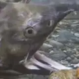
Fish Models - The Power of Light
I love to paint fish; they catch highlights in small doses. They have gradients of colors that go from cold to warm palettes. Within their scales, you can also find contrast in darker and brighter tones, plus they taste good. This picture was random, casual, and full of information, visually speaking, so I chose to try it.

What is important to consider when painting similar materials is to get the color or tone base medium, as you really want to make the highlight the protagonist. To do that, you should avoid bright tones in the base. Nevertheless, I did start from bright as usual but eventually added a high amount of soft strokes for shadows. On top of that, I played a bit with colors in a different layer and finally, over many sharp edges, I added texture strokes. You might ask, what gives that realistic look? Besides the amount of values, in my opinion, it’s the highlights, at least in this case.
.
Folds Chaos - When Shadow and Colors Collide
This practice is a great example of how you can play with colors within the shadows, but not slight ones like I often do, but very saturated ones. This light, I believe from a sunset, always creates the most beautiful shadows. The trick is to split the shadow and focus on how the blue is very clear at the top and, as it goes down, blends more toward a desaturated purple. I recommend you first paint the shadow and, in a new layer, add the colors and play around with the blending mode, all within the shadow shape. It would be too much trouble if you are trying to get the shadow shape while simultaneously adding the colors. Instead, with the method I suggest, you can stop worrying about shapes and focus on saturation and value tone.

.
Lemon Nose - Gradients on Brush Hard Shapes
I could have finished this lemon way quicker, but I could not get that shadow right. By right, I mean that it looked smooth but also textured. I could have done that; I was not interested in making a copy of the lemon. I wanted to create a sharp silhouette for the shadow, so after quite a while, I figured that using the brush, I could create that sense of gradient through hatching and yet stay sharp. I did add a bit of a dark value within the shadow to create the illusion of light bouncing from the floor, just to get the gradient to some degree. My favorite part, though? Definitely the big nose I accidentally created on the lemon’s face.

Practice 64/65 Process Video: https://youtu.be/p5VKOWIqFIA
Brushes: https://drive.google.com/drive/folders/1wHu8wuEHjDk-VfnZqv8iy8rwnvu8Ngmj?usp=sharing
Pre-order my book Life in Every Sketch on the 3DTotal shop: https://rebrand.ly/The-Art-of-RamonN90

Please let me know if you have any questions!
Ramon Nuñez
2025-09-20 06:06:56 +0000 UTCHector Espinoza
2025-09-19 18:38:01 +0000 UTC