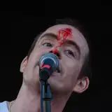
SamuKata
MegSyv
MegSyv

patreon


Ch7 Pg73 [BETA]

Hey Buds, be a new set of eyes for me real quick: I updated the Lettering on this page (here is the original for reference) and I wanna know how it reads. 

Does it make sense?
Does it have more impact?
Can you read the jumbled bits of dialogue or do they need a little more room to breathe?

THANKS GUYS

EDIT: YOU GUYS ARE SO INCREDIBLY HELPFUL I'M SO GLAD I DID THIS, I'LL BE POSTING AN UPDATED VERSION LATER TODAY FOR MORE FEEDBACK THANK YOU THANK YOU

Ch7 Pg73 [BETA]

Comments

Change good. Me like. The white text framing Thistle in the last panel does wonders. Reads very well.

Mia Pearce

Love it. Chaotic words echo her chaotic emotions. Presenting it like this makes it more authentic to how Thistle feels - all these words are running through her head half-formed, at lightning speed, and with this presentation, the reader really gets that feeling.

I know the whited drop shadow is meant to make the quotes read out like an echo, but that's the only part about it where I feel there's too much "white noise" making it seem more cluttered then intended. But also, I'm worried about that having some effect in print. The BG is already "faded out", and all that white on top seems... I'm not sure. It's readable, yes, but it's more a gut intuition then something I can visually pinpoint that there might be just a little too much going. And my only conclusion is the drop shadowed echo effect. Otherwise, the other comments are fairly on the spot.

Naziha Zahed

Yeah I think it would look just a bit better with it being just a bit spaced out.

Agreed

Data Wall

Looks good

maninblack

I like the idea, but I think that it could be just a bit more spaced out, at least the stuff you *want* to be legible.

RaptorusMaximus

I don't think it matters that parts of it are illegible. This better communicates the feeling of this situation, and we've read all of those lines already as it is. It's more important that we get the gist, and less important that every word can be read. I agree with Kathryn JWB who posted above, basically. :) I also disagree with using an outer glow/drop shadow. The contrast of the shadowed face of Thistle with the white text and lighter background works for me as is.

D. Alfonso

THIS IS AMAZING, THE IMPACT HIT ME LIKE A TRUCK

Lady of Monsters

I love the changes. To answer the questions specifically: 1. It makes sense. 2. It definitely has more impact. A LOT more. 3. A little legibility is lost, but it’s easy to read about 90% of it, and I don’t think you should change it. It’s not necessary to read every single word; to me, the most important thing is the overall impression of tumultuous, overwhelming memories/emotions that you’ve achieved. I don’t think it would have the same impact at all if every bit of text was clear. :)

Kathryn JWB

I agree that it more visually represents the chaos of thoughts in her head here. I don't have any issues reading the words, and can infer what could be missing. However, I think that it could be delivered better if you put a shadow text box behind the thoughts behind her head, like you did for her thoughts in the original. I think this could reduce the impression that those words look like a halo, emphasizing that these are dark thoughts. Maybe you could also move some of the new words away from the mouths of the people that are yelling. I really thought the eyelessness of Brent and those yelling villagers added to the sense of despair that everybody hates her, but that is lost a little when you can't see their mouths. It also brought more emphasis to the scornful glare of that guy near her shoulder, which is now being covered by PEST. Maybe you could move PEST over to the right a little bit too. I hope this is actually helpful and not just nit-picky!

I like the impact of the new layout, but agree that it loses too much readability. Maybe keep the cluster of words that's surrounding her head, but space out the quotes near the outside edges just a bit more?

This version definitely has more oomph to it, more emotion, more impact. That is good. However it Does come at a cost of readability. Especially the sentence "they are just cave elves, who cares anyway?" is very obscured on this version, but I think that is a Very important call back for many reasons (I don't need to tell you about that ofc, lol). So I would kindly suggest a bit of rework, if possible? To make it a bit more legible. Also, this might be a visual illusion, but somehow on this one the last panel looks a lot whiter, in an uncomfortable way. I think all the white text and text shadows add up with the white layer? I have no idea what to do about that, but you asked for layman feedback. I hope this is helpful. I only say, bc you asked for it and not to just criticise.

Galev

MUCH prefer this version, for many of the reasons already stated; it nicely delineates the sense of isolation Thistle must feel in this context as well; it's reminiscent of the Drath's speaking as well, implying the dark sources of the words echoing in her mind, as noted by Mike. It's hard to call out "thumbs up" when it's this dark, but this is art, so... {thumbs up}

Yohannon

Love the new format, much more evocative. I think being a little harder to read is good for conveying the cacophony (and I still found most of it readable enough). Agree with above poster Erica that "I think it was after her baby" specifically could use more breathing room.

Emily Rocke

Much more effective emotionally, I like it.

Elouan

The original page made me sad for Thistle. Reading this page, just as it is, I wanted to break down in tears.

Mary Williams

Ooh, I like this quite a lot! This looks very much how being trapped in my depressive thoughts feels. The words are a little bit hard to read, but I feel like portraying what being stuck in one's own head is like is more important. I really relate to how cacophonous it feels.

Katie McMahon

I agree that the words would be easier to read spaced out a bitnor in a darker color

Renee

I like it. That's how uncontrollable negative thought feels.. equal parts radiating from you and pressing in like an attack. There's also a callback to the Drath echo sticking to someone.

mike stone

I like. It reads a lot like my OCD and anxiety do. Intrusive thoughts without real coherence or relation besides the fact they're expressing one single idea (whatever painful thought is at the core them that day).

Chris Amann

I'm having a bit of trouble reading the text where it intersects with the other jagged white lines, or the light areas in the images like "cares" in "look, who cares anyway." I do like the new format concept better than the original, just maybe make the text easier to read with dark shading or outlining or something?

I like this new format too. It makes sense. I think it has more impact, since it radiates out from her. I can read most of the text; the hardest to read is ' I think it's after her baby' which I feel might be better slightly separated from the cloud of namecalling? I get why the 'mange flies' one is more mixed up in there. Maybe a tad more space for the ones closest to the cloud?

Erica L

I like the tight, angry text clustered around her head - it drives home the shattered glass effect in a way the original doesn't. I also really like the movement of "two heads" to the top-left corner where it gets read first! I do think some of the recollected quotes from The Crew get a bit lost, maybe partly because of the shadow effect on the quotes. We already know what they're saying, though, so I agree with the decision to keep some of that text covered up. I loved the original, but these edits double down on the emotional turmoil.

I think if you made the thoughts black or dark grey it would show her emotions and show up better. Also maybe space them out a little.

I think some of the text is a bit too hard to read because it's squished too close. I do like the new format though! I understand what you're getting at and I really like it! And I think it's good that you can see the pictures better.

Katie


More Creators