


мқҙнӢҖ м „мқҖ нҠёмң„н„°мқҳ Toshabi лӢҳмқҳ мғқмқјмқҙм—ҲмҠөлӢҲлӢӨ! мһ¬л№ лҘҙкІҢ мғқмқј м¶•м „мқ„ к·ёл Өм„ң м„ л¬јн–ҲмҠөлӢҲлӢӨ. м¶•м „мқ„ к·ёлҰ¬л©° мӢ кІҪмҚјлҚҳ л¶Җ분л“Өмқ„ кіөмң н•©лӢҲлӢӨ.
Two days ago, it was Toshabi's birthday on Twitter! I quickly drew a birthday celebration and gave it as a present. I share the thoughts that I cared about while drawing this.
нҠёмң„н„° нҒ¬лЎӯкіј мӮ¬мқҙмҰҲ, к°ҖмӢңм„ұм—җ кҙҖн•ң мғқк°Ғл“Өмһ…лӢҲлӢӨ.
These are thoughts about Twitter crop, size, and visibility.
м ҖлҠ” кұ°мқҳ нҠёмң„н„°м—җм„ң нҷңлҸҷн•©лӢҲлӢӨ.
I'm mostly active on Twitter.
нҠёмң„н„°м—җ мқҙлҜём§ҖлҘј м—…лЎңл“ң н•ҳл©ҙ, нғҖмһ„лқјмқём—җм„ лҢҖлһө мқҙлҹ° нҳ•нғңмқҳ к·ёлҰ¬л“ңлЎң ліҙ여집лӢҲлӢӨ. н•ңлІҲм—җ мөңлҢҖ 4мһҘк№Ңм§Җ м—…лЎңл“ңн• мҲҳ мһҲкі , м•Ңкі лҰ¬мҰҳм—җ мқҳн•ҙ м Җл§ҲлӢӨ лӢӨлҘҙкІҢ нҒ¬лЎӯлҗҳм–ҙ к·ёлҰ¬л“ң м•Ҳм—җ л°°м№ҳлҗ©лӢҲлӢӨ. лӘЁл°”мқј нҷҳкІҪ л°Ҹ лҚ°мҠӨнҒ¬нҶұ, кіөмӢқ м–ҙн”ҢлҰ¬мјҖмқҙм…ҳ л“ұл“ұм—җм„ң лӘЁл‘җ лҸҷмқјн•ң 비мңЁмһ…лӢҲлӢӨ.
When you upload an image to Twitter, it appears to be this type of grid on the timeline. Up to four can be uploaded at a time, each cropped differently by the algorithm and placed in the grid. It's the same rate for mobile environments, desktops, official applications, and more.
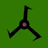
к·ёлҸҷм•Ҳ нҠёмң„н„°м—җ к·ёлҰјмқ„ мҳ¬лҰ¬л©ҙм„ң н•ӯмғҒ мқҙ к·ёлҰ¬л“ңмҷҖ нҒ¬лЎӯмқҙ мӢ кІҪм“°мҳҖмҠөлӢҲлӢӨ. м№ҙл©”лқјлЎң мҙ¬м–‘н•ң лҢҖл¶Җ분мқҳ мӮ¬м§„л“ӨмқҖ к°ҖлЎңлЎң л„“мҠөлӢҲлӢӨ. к·ёлҹ¬лӮҳ мҲҳмқё мқјлҹ¬мҠӨнҠёмқҳ кІҪмҡ°, м„ёлЎңлЎң л„“мқҖ кІҪмҡ°к°Җ нӣЁм”¬ л§ҺмЈ . м„ёлЎңлЎң л„“мқҖмқҙлҜём§ҖлҠ” к°ҖлЎң к·ёлҰ¬л“ңм—җ л°°м№ҳлҗ кІҪмҡ°, нӣЁм”¬ л§ҺмқҖ кө¬м„ұмқҙ мһҳл ӨлӮҳк°Җ мҶҗмӢӨмқҙ нҒҪлӢҲлӢӨ.
I've always cared about this grid and crop while posting pictures on Twitter. Most of the pictures taken with the camera are wide horizontally. But in the case of the Furry illustration, it's much more vertical. If the vertical image is placed on the horizontal grid, there is a lot of loss because more configurations are cut off.
л¬јлЎ , мқҙ к·ёлҰ¬л“ңлҠ” лҜёлҰ¬ліҙкё°мқј лҝҗмһ…лӢҲлӢӨ. мқҙлҜём§ҖлҘј нҒҙлҰӯн•ҳл©ҙ мӣҗліё нҷ”мғҒмқ„ ліј мҲҳ мһҲмҠөлӢҲлӢӨ. к·ёлҹ¬лӮҳ л№ лҘҙкІҢ нқҳлҹ¬к°ҖлҠ” SNSнғҖмһ„лқјмқём—җм„ң, н•ңлҲҲм—җ мқҙлӘ©мқ„ лҒ„лҠ”кІғмқҖ мӨ‘мҡ”н•©лӢҲлӢӨ. нҒҙлҰӯ н•ңлІҲмқ„ н•ҳлҠҗлғҗ л§ҲлҠҗлғҗм—” л§Өмҡ° нҒ° м°Ёмқҙк°Җ мһҲмҠөлӢҲлӢӨ.
Of course, this grid is just a preview. If you click on the image, you can see the original. But in a fast-flowing SNS timeline, it's important to get attention at a glance. There's a big difference between one click.
нҒ¬лЎӯмқҙ мӢ кІҪм“°мқҙлҠ” м•„нӢ°мҠӨнҠёмӨ‘м—җлҠ” мқҙ к·ёлҰ¬л“ңлҘј мқҙмҡ©н•ҙ мӣҗліё нҷ”мғҒмқ„ м „лӢ¬н•ҳл ӨлҠ” кІҪмҡ°лҸ„ мһҲмҠөлӢҲлӢӨ. м—¬лҹ¬мһҘмқ„ м—…лЎңл“ң н•ҙм„ң мЎ°кёҲмқҙлқјлҸ„ лҜёлҰ¬ліҙкё°мқҳ м„ёлЎң кіөк°„мқ„ нҷ•ліҙн•ҳлҸ„лЎқ н•ҳлҠ” кІғмһ…лӢҲлӢӨ. к·ёлҹ¬лӮҳ мқҙ кІҪмҡ°м—” мқҙлҜём§Җк°Җ л„Ҳл¬ҙ мһ‘아집лӢҲлӢӨ.
Some artists who are concerned about cropping may want to use this grid to deliver their original images. Upload multiple copies to free up a little bit of vertical space in the preview. But in this case, the image becomes too small.
мӮ¬мқҙмҰҲ л¬ём ңлҸ„ к°ҖмӢңм„ұм—җ н•ңлӘ«н•ҳлҠ”лҚ°, лҚ°мҠӨнҒ¬нҶұ лӘЁлӢҲн„°лҘј кё°мӨҖмңјлЎң л§Ңл“Өм–ҙ진 мқҙлҜём§ҖмқҳкІҪмҡ°, мһ‘мқҖ лӘЁл°”мқј нғҖмһ„лқјмқё м—җм„ңлҠ” л””н…Ңмқјл“Өмқҙ ліҙмқҙм§Җ м•Ҡм•„ мһ„нҢ©нҠёк°Җ л–Ём–ҙм§ҖлҠ” кІҪмҡ°к°Җ мһҲмҠөлӢҲлӢӨ.
Size problems also contribute to visibility. For images based on desktop monitors, the impact falls on the small mobile timeline. Because I can't see the details.
к·ёлһҳм„ң мқҙлІҲм—җлҠ” лӘЁл°”мқјнҷҳкІҪм—җм„ң ліҙмқҙлҠ” нҒ¬кё°лҘј кё°мӨҖмңјлЎң мөңлҢҖн•ң лӢЁмҲңн•ҳкІҢ кө¬м„ұн•ң л’Ө, лҚ°мҠӨнҒ¬нҶұмңјлЎң мҳ®кІЁ мһ‘м—…мқ„ н•ҙ ліҙм•ҳмҠөлӢҲлӢӨ. м–ҙлҠҗм •лҸ„мқҳ м„ұкіјлҠ” мһҲм—ҲлҚҳкІғ к°ҷмҠөлӢҲлӢӨ.
So this time, I tried to make it as simple as possible based on the size you see in the mobile environment, and then move it to the desktop. I think there's been some success.
PS. HAPPY BIRTHDAY AGAIN TOSH!!!
Toshabi
2020-09-23 08:28:37 +0000 UTC


