Dear heroes,
My apologies for being somewhat absent this month. I wanted to prepare more updates for you from the book, the art, behind the scenes, but running the campaign is intense and full-on. We've hit $425,000 and still have four days to go. It's exciting to exceed our expectations and yet manage to not go completely overboard, creating pledges that would be excessively hard to make. We've got new dice colors coming up, some more postcards, lovely little things all round.
And yet, I'd be lying if I said that running a crowdfunding campaign isn't exhausting.
It is.
It's a constant race to prepare the files for updates, get previews of unlocked stretch goals looking ready, making sure we don't shoot ourselves in the foot with any excessive promises, and more. At the same time, I'm beavering away in the back-end getting the guidebook proofed and edited for release.
The good news is that it means I have all the files laid out and looking presentable—if not yet entirely finished. For example, the big maps are laid out, look lovely, but I'm still going to add more places, routes, travel times, things like that.
For the way I work, this is actually very relaxing. I often procrastinate before a big project, stress too long about setting up files and getting them in shape, then find it very easy and pleasant once I'm creating and not fretting about technique.
The bad news is that it's exhausting and I am feeling it. You know that hard-boiled, gritty feeling behind the eyes, from working till your brain's on fire? That.
So I'm looking forward to the finish line.
Again, I can't say thank you enough for understanding.
Now, to share some pretty stuff.
:::--:::
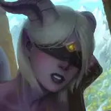
So ... one of the things that we ended up making was the campaign limited edition covers. This is always a big draw in both ways: attracting folks to the campaign and requiring me to do some big drawings.
This was the original UVG voidwalker foil cover back in 2019 (we're reissuing it as a poster).
It's pretty, and the foil works great, but my technique's also improved since then.

Now, this time we're doing a box set and two books so ... uh ... for the limited edition I need to do 3 drawings of this size in a style that works with foil. Foil printing is kind of finnicky. You can really only do one color and you have a minimum size & distance between lines.
About ten days ago, over the weekend I figured out how I was going to do it. You see, I didn't want this to be just random art but something that fits within the setting. Of course, this being a campaign, I first had to race to make sketches ready for mockups first ... not the complete covers.
Here are the mockups, along with surprised Yellowlander locals observing the exotic, reflective monoliths.

The key to the whole thing was the box.
The OGA book extends the Vastlands up the Ladder of Heaven and into space, and we call our discord community the stratometaship. The stratometaship idea is based a little bit on a science fantasy space station I ran ages ago, and a lot on various comic books and movies that marinated inside my head over the years.
I'd wanted to map it for ages, but never quite figured out how ... and then it hit me ... the box is 3-dimensional, so I can map the stratometaship from ... six different sides.
First, I did a test on one panel of the box (panel A, the bottom one).

Visually, it worked ... but the process was too fiddly (aaargh, the variable brush I designed for the drawing in procreate!) and the thin lines / spaces were too small to work with the foil print. Also, combining text and drawing was just too much at this stage. Still, I'd learned enough to know I could make it work.
But ... it took me two days of testing and fiddling to figure this out and could I have it ready in time for the EF updates on backerkit? I wasn't sure.
Wednesday I set to work on the cover. By around 3 in the afternoon I knew this would work, but ... then off-screen life intervened and it was suddenly ten p.m. and the gentle child was finally calmly asleep.
I decided to work late.
I had the sketch ...

By around 2 a.m. I had the full front piece.

To play up the machine element, I used symmetries as I drew, then did a new pass without symmetry to add the ravages of time and entropy. Again, not a completely finished piece, but much further along and now I had a technique.
Four hours of sleep later, I got sign off from EF at the morning meeting. We could make it work.
Conveniently, this map will also work as a blueprince scroll inside the book, illustrating (and mapping) the location. Two birds, one stone! (blueprint: so white on blue paper texture)
For the VLG guidebook I did a quick sketch, adapting a piece from a few years ago (that was meant as the cover of Uranium Butterflies when I was thinking of calling it Beyond the Black City and which I used on the A5 VLG).

You can see this is still really janky. I'll redraw the sides of the city and the characters, use more even lines, add more detailing, double-check the size and thickness of the letters. All that stuff. And, of course, that wide field on the left still needs something. Probably a vome or something. Still. Like I said, the technique has legs.
And by this point I had designed a set of brushes to work with that give me the exact line thickness I need: 0.5mm and 1mm to produce the foil effect I want. And a grid that lets me keep an eye on line density so I don't produce accidental fills (I need to keep 0.5mm between lines of foil to let the printing work.)
Anyway, for an hour of work, this cover looked good enough. And for the renders I only needed the front! (phew!)
Now, with the OGA cover, I knew much better what I wanted to do. There's a piece of a biomechanical god inside the book ... and I wanted to give it more oomph.

So I started with the cover layout grid. Again, at 600 dpi, so I can be sure of having enough detail if I want to make the picture bigger.
Thanks to the previous tests, I had the technique I wanted and the brushes and ... voila. I made the front in time for the renders.

And then, over the weekend, I finished the back as well:

I'm certainly going to tweak it a bit more before it goes to print, add a few more characters, make the texts fit in nicer, output it as a .tiff file rather than a compressed quarter-size jpg (haha) ... but ... cover done!
Though I'll be honest ... I'm still almost more of a fan of the Flying City on the regular cover. The colors, they just make it for me :D.
:::--:::
You've read this far? I have a bonus for you! The voyage events, revamped, laid out, with pretty art. Finally!
Also, by popular request: stripes to make the tables easier to use.

And from the guidebook ...

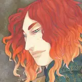
Some of you who've been here a while might recognize that piece on the left. It's from Uranium Butterflies! But I cleaned it up a bit, made the sky bluer, and extended it to reveal the whole house golem!
Here was the original piece:

Sometimes archiving the original layer files really pays off!
Ok.
That's the news for now. It's back to reviewing editing suggestions for me (shoutout to the Knights Grammarian!) and ... probably Thursday: the first public release of the guidebook PDF!
Yours in low and high battery modes,
—Luka
----///----
And, just in case you're dropping by from somewhere outside the patreon and got this far and it's still August 2024, the backerkit link: https://www.backerkit.com/c/projects/exalted-funeral/our-golden-age-an-ultra-violet-grasslands-rpg-sequel
WizardThiefFighter
2024-08-27 23:48:50 +0000 UTCTwisting H
2024-08-27 23:08:21 +0000 UTCRichard Fraser
2024-08-27 17:44:18 +0000 UTCEric McConaghy
2024-08-27 15:52:18 +0000 UTCPaul Goldenstein
2024-08-27 14:43:11 +0000 UTCWizardThiefFighter
2024-08-27 13:05:32 +0000 UTCNate W.
2024-08-27 12:42:11 +0000 UTC