CQ Retrospective (Chapter 2 - Part 1)
Added 2020-06-30 22:04:30 +0000 UTCAs always, thank you for being here. It is now time for:
Chapter 2
This chapter was a big turning point for CQ, and still the point at which I think the comic becomes "good," so I'm excited about this one.

I'm still pretty fond of Trebleopolis' overall palette. It's a bit less gaudy than I remember.

I included this bit because I wanted to establish that Almond would be carrying the Dream Sword from here on instead of Cucumber. In retrospect, though, I don't think anyone would have questioned it if I hadn't done this.

I hate to say it, but musical numbers in things that aren't capital-M Musicals give me deep secondhand embarrassment. Maybe Cucumber really is my self-insert.
Tangentially related to this: several years ago, I considered doing an extended gag where magic would only work in the Melody Kingdom if the caster could recite a suitable spell that rhymed, to the embarrassment of Cucumber and Peridot. It was, as they say, cringe.

This throne room definitely looks more on-theme than Caketown Castle's. I still wasn't sure how the black keys were arranged on a piano, though. I almost mirrored half of those treble clefs in the windows, before realizing they would just look backwards from outside.

Cymbal's design was a bit unusual, but I like it. People told me Clarinet looked like Prince.

Piano (Fortississississimo)'s first appearance. I was drawing heads very large during this period, but I still like her design maybe the most of all the princesses. The simplicity is nice.
Her room feels barren in this scene, but I didn't want to get carried away, considering we'd never see more of it... Actually, wait, is this her room at all?

This is Mutemaster's handwriting, by the way. He does write in all lowercase.

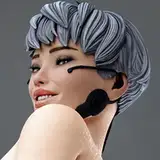
Once again, any excuse for a costume change. Almond looks way different with her hair down.

Noisemaster's initial appearance was the first major style shift in the comic, so I'm posting these pages in their entirety to show the color transition...which I think is a little clunky, looking at it now. I could have made the concert hall significantly bluer once the lights were off to make this page look a bit better.
A lot of people thought this page was an explicit Parappa the Rapper reference. I like Parappa as much as the next person, but...

Noisemaster's style is meant to be all clean edges and sharp contrasts, so I didn't use the usual chalk brush here, and even some of the feathery shading in this page gets phased out as the chapter progresses. As an example, I would have painted Noisemaster's eye way differently at the end of this chapter, after I got more comfortable with the design.
The blur in panel 2 is all Photoshop filter, by the way. It was more appropriate in this case than doing it by hand.

This, I think, is the best looking of the Noisemaster intro pages. The top panel is about as close as I got to exemplifying the style I wanted. This was also the first page where I chose the color palette before I painted anything, and I stuck with that process for the rest of the chapter.

Wow, check out the halftone. What is this, a comic?

Mutemaster's first, uh, offscreen appearance. Mute's colors are rarely "true" grayscale.

I was living. I do wish I'd made the Nightmare Knight a bit easier to pick out against the very dark background here, though.
From here on, in scenes like this, my intention was for the color palette to shift in favor of the Nightmare Knight, while the visual style would remain the Disaster Master's.

I changed the Nightmare Knight's line to "...acting like this" in the books because "talking like this" is an unfortunate choice of words in this case. The point is that Noisemaster hams up his persona with the knowledge that it gets on his boss' nerves, not that his dialect has fundamentally changed over the years.
Also, I think this scene might be the only one where the Nightmare Knight's speech bubble changes to look more like a Disaster Master's. It helped with readability here.

This is exactly the kind of dad joke the Nightmare Knight would make himself, so I don't know what he's so upset about. Maybe he's jealous.

Yeah.

Noisemaster's color palette is meant to become a bit more restrained when he's being serious, but I guess in this case it's indistinguishable from the Nightmare Knight's colors.

This is the height of my "googling musical symbols without having any idea what they mean or how they're supposed to be used" period. Honestly, this poem is pretty cheesy, but at least the meter is solid.

Good mouth on the Oracle here.

We never see Intermezzo Wall from the other side, but it probably has piano symbols there.

This page was fun. I admit that Mutemaster's power is vaguely defined, and a lot about how it works was decided as I went. What I settled on was: it's not exactly a "time stop" power, it just stops people from moving and magic from functioning.

I love this serene panel of Bacon being one with nature.

It became a running joke outside the comic that the blimp clown died in the crash and was never heard from again.

Carrot clearly tried to save him, but Carrot is not a doctor.

I can remember the game I had been playing around this time that made me want to do a "sidequest fatigue" joke, but I'm not going to name it. Even your incredibly generous $5 a month, for which I am deeply grateful, cannot get me to express inflammatory video game opinions online in 2020.


The color palette shift here is meant to say "hey, the Nightmare Knight is about to show up."

See??? This freakin' guy!!!
I had been looking forward to this scene for a long time. I think this was the first scene where I started to figure out how I wanted to render his cape (on the "default" setting, anyway). It's a lot fluffier than it had been previously.

The Nightmare Knight appeared in this scene with the intention of helping Cucumber and friends reach Noisemaster's lair. He could have done this without revealing himself, sure, but deep down, he was hoping to be able to talk and judge Cucumber's character for himself.

One of my friends edited this panel to say "Do not think a siggy on that sword," et cetera, and I remember it literally every time I think about this scene.

You can see the Nightmare Knight's tiny leg here. Why did I do that? It's like my most important rule about making him look imposing and I just broke it like it was nothing.

This scene is the first point at which Cucumber considers that the Nightmare Knight isn't evil. I wish this could have been more thoroughly explored a bit sooner, but the two of them don't meet again until the Flower Kingdom.
Also, this is less important, but I came to really enjoy drawing cracked stone here.

I remember streaming this page. I'm 95% sure there's a creepy hand in place of Almond's ears here, covered up by the speech bubble.

They forgot to do this. Boltergeist remembers, though.

I loved coming up with bits and pieces of the Pumice universe. Galactiqueen Meteorea was a well-loved villain among viewers of the show, and while she doesn't say so here, even Almond thought she was pretty cool.

The influence probably speaks for itself to anyone familiar, but I'll say anyway that this area was heavily inspired by Twilight Town from Paper Mario 2.

Mayor Lute! I really like her design, but I admit it works a lot better when you can see her full body. It may seem obvious, but it's best to make characters visually interesting from the angle you see the most.

I like this gag partially for the idea that everyone in the Melody Kingdom is prepared to just pick up an instrument and try to do an impromptu musical number, even if it sucks.

The setup for Count Legato was originally going to be something like "he kidnaps beautiful girls from the village every night!" but I decided I didn't really want to frame it that way. I can't remember whether or not the frightened person here was meant to look like Mandolin, Lute's son, from the beginning.

Here's the style shift that ended up persisting the longest out of any of them, I think.

It's not really that big of a difference fundamentally--I just used soft round brushes (a few textured brushes were used here, but I stopped eventually,) and tried to emphasize intense, "theatrical" lighting. Because of the high contrast, and because of my previous experience printing the first book, it was a lot easier to convert these pages to CMYK than you might think.
Anyway, here's Count Legato. He might be the first (or only?) major character with a name that doesn't really have much to do with his character design. I seem to remember referencing pictures of church organs when designing him, but he doesn't look much like a church organ... Hmm.


This was so fun! I think I could have pushed the contrast further to make it feel more like stage lighting.
The black margins between panels add a lot of atmosphere, but it unfortunately leads to some readability problems later, when the borders aren't clearly defined. One scene comes to mind, so I'll wait until we get there to talk more about this.

I switched back to white margins for a gag, but it made this page kind of a pain to format for print.
At this point, I moved into a new apartment, so I took my very first hiatus from the comic after 2.5 years. That seems like as good a point as any to stop this episode, so we'll cover the Legato arc and Noisemaster next time. See you then!
Comments
I've always been so blown away by the colors in the noisemaster segments. Thank you for this write up! :D
Capsule
2020-07-02 15:35:16 +0000 UTCevery single page Noisemaster appears on is An Absolute Delight and he's easily one of my top three characters in this comic for the color scheme alone
2020-07-01 03:01:16 +0000 UTCThese are the highlights of each end of the month for me. Thank you so much. Cucumber Quest helped in many ways, so reading about your thoughts while making it is very special to me!
Cinnamoonie
2020-07-01 00:32:19 +0000 UTC