CQ Retrospective (Interlude 3)
Added 2021-01-25 07:56:08 +0000 UTCWelcome back! Let's get into it.

I can't seem to find any preliminary sketches for Almond and Peridot's dresses here, so I think I just made them up on the spot, maybe because I was short on time. I think it would have been cute if Peridot's hair had been pinned up. Also, I wish the values on this page were better! That bottom left panel is really washed out.

This too! I think that since it was meant to be a "bright" scene, I was too afraid to use dark values. The result is that Almond's hair is the darkest thing in this panel, and it really stands out like a sore thumb.
The reason why there are cats on Peridot's side of the aisle is obvious, but I think this was the first point at which Cordelia was so obviously implied to be her "actual mom".

This scene was meant to foreshadow Peridot's backstory, which would be explored in Chapter 6, but a lot of what I had planned has changed completely since I wrote this in 2015. It's probably a good thing that I was so vague about it. (Although, Peridot worrying that Cordelia might not approve of her crush on "a hero" still stands.)

I didn't put much effort into designing Peridot's room here, which came back to bite me in the [pg-13 swear word] later.
Forgive me for harping on this, but my value control was really bad here. I seem to remember these pages being difficult to convert for print, too.

Undertale had been released a few weeks before this page was posted. There was a little banner ad for it on my site at the time, which is bizarre to think about.

Adding a light source helped a lot with my value problem, but it feels a bit like a crutch.

I mentioned in Chapter 3 that I changed Carrot's costume in part because I was sick of the Caketown Castle uniform. This meant, of course, that I wanted to change Tomato and Lettuce's costumes as well. I don't think I did a very good job of showing them off, though. Less gloomy lighting might have been better here.

I really like this panel for some reason.

This page was fun, and also something I had been looking forward to for years. The "low-contrast pastel" problem is back, unfortunately. I think I could have made the Nightmare Knight look a bit more affected by the lighting in the room, but maybe the fact that he feels like a cutout works for him.

This isn't a first in CQ, but I'm thinking about the use of panels like #1 here to show the passage of time. Cutting away from the characters to a view of the scene or a close shot of a prop like this is effective to show that there was a gap between this page and the previous, but I can't really articulate why. I guess the same is true in cinema.

This was the first reveal that the Nightmare Knight could change his size, but I'm pretty sure this scene is the only reason that's the case.

The speech bubbles in panel 2 here were only darker because they overlapped with the Nightmare Knight himself. Otherwise, they're the same color as him. They are effective for suggesting a shift in tone, though.

As mentioned in previous installments, Dreamside is eternally trapped in the 90s, where you have to record individual episodes of TV shows instead of just using one of several streaming services to binge an entire season at once. You should applaud me for the self control I demonstrated in not giving Peridot a CRT.
The Pumice theme song vaguely exists in my mind, but I'm not very good at music, so it will probably remain there.

Peridot and the Nightmare Knight watching Pumice together was something I'd wanted to do for a while, but I hadn't thought much about the actual content of the show before this scene. It's a very basic Sailor Moon parody, but I like to think there's some heart in it.

I love this stupid page. If you aren't familiar with Kirby, Melanite is meant to be a Meta Knight gijinka. Probably one I would genuinely have drawn when I was 16.

The values in this scene are a lot better. I still wasn't sure how to (or if I should) show direct light affecting the Nightmare Knight, though.

I liked that second panel so much that I used it as the icon for the CQ Twitter account for some time. Also, here's another example of the Nightmare Knight's speech bubbles darkening to suggest a change in tone.

Trying to pack a sense of scale into a small panel like the leftmost here was always pretty rough. I could have shifted the angle a bit to make it look more like he was towering above her.

I like this page overall, but I think I could have made the layout a bit more interesting. The Nightmare Knight is basically the same size in each panel, which is unfortunate. Also, it might have been cool to lift the panel on the bottom left so that it didn't align perfectly with the next two--that way it could have served as more of a transition.

This warm, pink light intensifies to show that Parfait is getting through to him.
I have to admit that I cringe very slightly at the last line here... It's fine that it's not subtle, but it feels like a clumsy way to call back to the "fear" theme, and I probably could have come up with something more natural.

I still like this page (and sequence) a lot. Even after Rosemaster, I still wanted to do really ornate initial capitals. (I was planning to go full-on illuminated manuscript initially.)

This border was really fun, and I'm still happy with the writing, too. But...am I getting old or is this lettering way too small? At the very least, it would have been good to pick a darker color that stood out against the background more.

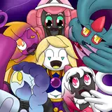
Another favorite page of mine. The Nightmare Knight has a good feeling of "volume" here that he doesn't usually. I used the bottom panel as the CQ Twitter's banner (and I think it's still set to that, actually). Quakemaster's design hadn't been finalized, but everyone else looks about the same. (The orb at the top is Glitchmaster.)
Once again, the way to make Splashmaster look imposing is to obscure his mouth.

The guardrail over Parfait's balcony was completely forgotten in the last panel, but by the time I noticed, I also realized it would make her silhouette very hard to read, so I just left it out. It isn't in the print version, either.
Looking at the print version, by the way, I see that this purple hue didn't translate very well. Bummer!

I took a children's book illustration course in college, and my final project was done in a style similar to this.

It bothers me that Parfait isn't looking toward the camera here. It would make this a lot more impactful.

Parfait looks a bit off-model (using that term loosely) in the left panel. I think it's because I didn't draw her entire head under the speech bubble.

The Nightmare Knight looks especially frayed here. I keep changing my mind on what his, uh, "surface" feels like, for lack of a better way to put it. I think that during this period, I wanted to make him seem like a concentration of shadows.

He seems to fray where Parfait hugs him. The idea was that his heart accepted her friendship even if his "nature" rejected it.
Oh, I remember livestreaming this page. It might be one of the last ones I did?

In this case, I figured it was fine for the speech bubble to be the same color as the Nightmare Knight. His little shoulder wisps are serving as a tail for it, too.

The thing bundled up in Cordelia's arms, if you were wondering, is her spacesuit. The reason she had it was going to be a bit different when I drew this page.

I think I may have genuinely forgotten a tail on that bottom left speech bubble... but when they're stylized based on which character is speaking, it isn't always necessary for them to have tails.

The way the light behaves here probably isn't logical. Listen. I don't care. I could have made it a bit more intense behind Cordelia's head, though.

This is another ambitious panel layout with dark margins that ended up being very hard to read. There are five panels here in total: one on the first row, then two on each subsequent row. The idea is that Glitchmaster is replaying a recording of Rosemaster's previous conversation with her over and over, and when Cosmo runs in, she turns the replay off. I got a little carried away with the aesthetic, unfortunately.

To be honest, the true nature of Cosmo (and Cosmo's relationship with Glitchmaster) has changed quite a few times throughout the lifetime of this comic. I was finally starting to settle on the details here.
The all-caps dialogue is meant to convey that Glitchmaster is speaking in an affected "robot voice." When she switches to normal capitalization, her tone is more natural.

Glitchmaster's aesthetic looks a bit more elegant here than it did in Chapter 3. I still really like how this part is composed.

The silhouettes in the foreground of panel 1 here are an interesting color choice. In early pages, I pretty much always made extreme foreground elements the darkest value on the page, but here they're a bit lighter than the focal point, which I think works just fine.

As I said earlier, I hadn't decided on Mr. R's design back when Brambleby was introduced, but this was gratifying to finally get to show off. He was sucking in his beautiful lips the entire time he pretended to be a butler.

Princess Azalea's "Saturday" accent would have to be an affectation, but it feels more "real" than than her "real" voice... I guess there's no helping that.

I don't think I mentioned this the last time it came up--Cabbage's part-time job gag was inspired by Touya from Cardcaptor Sakura. During this scene, I really wanted to drive home that Cabbage, while kind of a jerk, is really just playing around most of the time.

If you compare this page to the one it was referenced from...

...you can see the lessons I learned from having to convert my colors for print. I did get a bit less ambitious with filling in minor background details, but I sincerely believe that was for the best.
2016:

2011:

Cucumber's porch feels a bit more carefully constructed in the old page, but the scale feels bizarre. also think simplifying the color palette not only looked more appealing, but saved me a lot of trouble.

Chardonnay's headpiece was always meant to be see-through like the base of a wine glass, but I hadn't figured out how to render it until this point.

Cumulo Puffington was not meant to look this much like Mario. I may have to change his design.

I don't think to do this very often, but it's fun to use tiny text in a big speech bubble like this as though all the unused space is for things the character is holding back from saying.

Mistmaster's first appearance. The nature of his "curse" changed a bit from the time this page was posted, but he was always intended to be a Disaster Master the Nightmare Knight had done something very cruel to. It's a bit less pronounced in his later appearances, but I relied heavily on watercolor brushes for his aesthetic.
Here, at the end of Interlude 3, I took a break from the comic for about two months. This was, if I'm being honest, the earliest point at which I started suffering from serious burnout. During the break, I was able to complete Lady of the Shard, which gave me the second wind that carried me through Chapter 4. Despite the difficulties, I'm still really fond of it.
But we'll talk about it next time!
Comments
I really love catching up with these. thank you for taking the time to write them and share them with us
2021-01-30 23:22:21 +0000 UTCThank you for these write ups!! :D
Capsule
2021-01-26 05:11:52 +0000 UTClady of the shard is how I first found you! c:
Alysha Atkinson
2021-01-26 01:39:17 +0000 UTCoh mistmaster...my heart ; - ;
Hayden Andre
2021-01-25 17:16:27 +0000 UTC