CQ Retrospective (Chapter 4)
Added 2021-03-08 23:21:22 +0000 UTCHowdy! Let's get started.
Chapter 4 began mid-2016, after I'd taken a few months off to publish a completely different comic. Naturally, readjusting was a little tough, and I struggled through the first few scenes...but I think it resolved into something I can still be proud of.

This may have been the earliest point it was mentioned that Peridot wasn't actually from the Crystal Kingdom. This had been in my mind for a while, though originally she was going to have spent her very early years there.
Cordelia's speech bubble is a bit darker to distinguish it from Peridot's in the last panels, but I decided to use a white gradient instead of having the margin cut a line through it.

Concepts for Cordelia and Peridot's snow clothes. I think this was posted on Twitter some time ago. Peridot takes her hood down later.

The "Super Peridot" mentioned here is the very same from the minicomic I made a couple of years ago. I had the idea for it around this time.

As mentioned earlier, I was pretty unhappy with the composition of Chapter 3's title page, so I put more thought into this one. I think it came out much better! I've always thought ice and snow look really beautiful with warm lighting, so I wanted to feature that as much as I could. Also, there's a bathtub drain right in the center that no one commented on until it became relevant. My evil trick.

I had originally written this entire scene, with Cucumber and friends arriving to the Crystal Kingdom, losing sight of Azalea and then proceeding to Quartzton... I realized quickly that it was a really boring opening to the chapter that would have taken at least ten pages, so I summarized it with Nautilus' diary entry instead. This may have been one of the earliest times I considered more dramatic ways to make CQ a bit more efficient.
After the cleaner style at the end of Chapter 3, I leaned more toward fuzzy, textured brushes in this chapter. It was helpful for cutting down on the amount of rendering I had to do, and in panels like these, it gives the scene a dreamlike feel... but frankly, it did end up looking pretty sloppy in places.

Like here! This establishing shot of Quartzton is really underwhelming. I was so eager to get past the boring setup that I confined it to a tiny little corner panel, when it could have been something really impressive! Sometimes, taking time for these seemingly unimportant things is worthwhile.
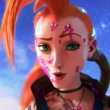
Ametrine's first appearance. One of my big design regrets is that I didn't fully think her hairstyle through. I had no idea how to draw her from a different angle at first, which is why this page uses the exact same one twice. Oops!

It looks a bit less cool here.

Speaking of things that look less cool, I'd like you to join me in a moment of silence for Carrot's new outfit, which immediately crashed into the wall of "I don't know how to render it in this lighting and also there was just a cold weather outfit change so I need to throw something on him to make him look warm." RIP.

I think this gag is still solid, and probably one of my favorites between these two. But the comicking here is killing me! Peridot is standing in a window which places her above everyone else in the room, but there's no establishing shot to tell us this! Plus, Queen Sapphire is looking down? Who's she talking to? Huh?!
I know, I know, I'm being really rough on myself in this episode. But I genuinely think I just forgot how to make this comic for a while!

There's not much to the design of the Quartz Palace, since it only appears in one panel...but it would have been nice to add a few more decorative flourishes.

These are some messy concept sketches for Quartzton, by the way. I think the slightly green lighting in that top thumbnail is pretty cool, actually. (That one sketch of Cordelia was for the title page.)

I had also forgotten about the journals until they became a useful storytelling device. Thanks, Nautilus!

At this point, I became aware of how dissatisfied I was with the previous pages, so I put a bit more effort into rendering cleanly and establishing the scene clearly, even if the level of detail remained low.
If you're wondering, the whole "cloud pattern on the handle" thing was not something I had come up with prior to this chapter. (This may have been obvious...)

Cirrus and Cinnabar were only sketched once or twice before they appeared in the comic.

Cucumber's wand normally has little dots on each of the five star points, unlike the Pumice wand here. But... I forgot to paint that detail all the time in previous chapters, so I hoped at least someone would assume I was just being forgetful again.

Cucumber and Almond get in an argument!
I get a little annoyed by scenes in cartoons where characters who care about each other get into fights for reasons that feel contrived, so I wanted to consider both characters' viewpoints thoroughly. (But also, it was fun.)
Because this scene happened in the middle of an empty snowfield, the atmosphere was basically built in. There were trees in the surrounding area, but I think the empty space was more effective here.

This page is unfortunately a little too low-brightness-low-contrast. Chapter 4 hasn't made it to print, but if it ever does, I'll definitely want to adjust the colors here.
I wanted to reference the previous NK encounter with the cracking panel borders, but I'm not crazy about how it looks... The gradient in the margins feels especially off. Also, wow, the lettering got pretty big all of a sudden, huh? I tended to write bigger when I was less stressed about fitting everything on the page, but... I do wish I'd standardized the size of my lettering by this point.

In the Glass Mountain, there's always an intense white light coming from just further in. I think the intention was to make it feel colder.

These are some early sketches of the mountain (and Nautilus' snow clothes.)

After Carrot's big thing in the previous chapter, I felt that Nautilus was the one party member left lacking substance to their character. She had been portrayed as kind of a happy-go-lucky ditz, but I wanted to get across that she genuinely did care about her place on the team and the wellbeing of her friends. Her forgetfulness was introduced as a joke, but I thought there could be more to it. (It's something I struggle with too, you know?)

The art in this scene bugs me a bit because the light should be just as intense on everything else as it is on Almond's face. I guess I was afraid of overusing white highlights because I was told by teachers to avoid it.
Well! I'm your teacher now! Don't be afraid of highlights! There is such a thing as overuse, but sometimes you can't develop the right sense for it unless you're willing to crank the lever all the way up!

I was experimenting with Photoshop brushes here, so the rendering is a little different, but I like it. This was the first scene where Cordelia met our heroes...which felt strange to realize 5 chapters into the story.

Oh, I just remembered from looking at this panel! I took Dice Tsutsumi's Schoolism class around this time, which is where I picked up the habit of painting shapes by using the selection tool. It really helped to streamline my process, and I still do it quite a bit. The brushes I was experimenting with here largely came from that course.

Painting the cracked surface of the crystal was very fun. I probably could have come up with a more creative visual representation of the Forsaken Master's seal, but...hey, it's the Crystal Kingdom.

The Forsaken Master's color scheme (at least initially) is green, so I transitioned toward that on this page.

Almond's Anxiety Elevator was certainly inspired by the confessional scenes from Utena. Originally, I wanted there to be buttons all the way up each of the walls, but I couldn't get it to look right.

On these pages, I tried to be a bit more conscious of how visible panel divisions were on the dark background...which, if you can't tell, is not black! It's a very dark blue-green.
The panel on the right cutting into the panel underneath almost feels like cheating to lead the eye. But by this time, I had learned that there's no such thing as cheating in comic layouts!

I introduced this whole subplot as a fun diversion after the story got especially heavy. The way it interacted with Almond's character development was basically coincidental, but I leaned into it up until the big reveal.

I remember I had some difficulty finding a "growth chart" that would work in the middle of a void, since most of them are hung or painted on walls... In the end, I decided that as long as it looked like a ruler and had a cute giraffe on it, it would get the idea across fine.

This line was meant to parallel another line from earlier:

Almond's inability to acknowledge her own fear became a big part of her character. It was one of those things that felt natural after I started taking my characters a little more seriously, like Nautilus' heart-to-heart with her earlier in the chapter. "How will she deal with it when it's time to confront the Nightmare Knight?" I wanted that to be the question hanging in the air here.

In retrospect, it might have been fun to put a bit more thought into what movie Nautilus was being shown. It could have been an ancient film from before Besty was sealed away...or maybe something he came up with himself?
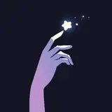
The text behind Nautilus in the bottom right is "A triumph," by the way. And, did I draw each of those "5 stars" by hand instead of just copy-pasting them? Why'd I do that?

I really exhausted my stockpile of puns for this. I had another idea for "fear of airplanes" where the kids would be crowded around together folding paper planes, but it didn't feel sharp enough, so I repurposed it a bit later.

Speaking of cuts, I kind of regret this one.

The cut-off text at the bottom of the survey includes "My power is returning." It may make more sense after the introduction of Steve.

If CQ were created with the intention of being a purely digital comic, I probably would have tried making the bottom three panels an animated gif. Also, I still have some sketches of Cordelia's face here:

I was having fun.

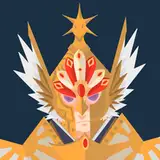
Anyway, here's Besty! Though the Forsaken Master plot was kind of a new addition, I'd considered the concept of a rejected Disaster Master before--I just wasn't sure what to do with him previously. Here's how his design evolved:

I knew from the beginning that I wanted him to have a big tophat and a pathetic-looking face, but that's about all that made it to his final design.

I was going for a puppet look, but he felt too lanky here, and I didn't want him to have the same proportions as the kids. I also drew some concepts for Steve disguised as a Dreamsider on this page.

The addition of the cloak was a major improvement. I don't know what I was thinking with that Doug nose, though.


Eventually, his design became something of a mix between Squashini from Kirby's Epic Yarn and the Lantern Ghost from the original Paper Mario.

And this is the final sketch I drew of him before his appearance in the comic. This file is named "Besto.png", so I guess that was going to be his nickname at some point. It's less cute than Besty, I think.

Don't feel bad, Besty. I literally Googled "list of common fears" when I started running out of puns for the previous scene.

His original name was actually going to be "Fearmaster." I went through a lot of different names for him before settling on the stupidest one I could think of.

This is truly one of my favorite pages of CQ. I don't have anything else to say about it.

I only realized well after posting this page that this exact punchline had been done in Paranatural. I guess, if you're going to unconsciously steal a joke, you may as well do it from the best. Sincere apologies to Zack, whose comic you should absolutely be reading.

I think that as CQ got more and more serious, I got a bit too caught up in making my characters' faces more "realistic" (using this word loosely) to fit the tone... But they really do look best like little squishy cartoons. It's not like simple faces can't convey complex emotion, after all.

This scene was something I had looked forward to for a while. I wanted there to be a chance for Almond and Peridot to finally bond over Pumice thanks to someone who couldn't care less about it.
Parody magical girl transformation sequences were a dime a dozen even when this comic was made, but, as with the actual episode of Pumice from the previous interlude, I wanted my earnest appreciation for the genre to shine through.

Here are some sketches I did of Cucumber wearing Pumice's costume.

It's good that he just disappears in the second panel here. This is not about him.

Concept sketches for the "Besty Super Show".

The final stage took some cues from Kirby Super Star's environment design. It ended up looking much grander than my original intent, which was "cheap puppet show at the mall."
I vaguely remember some criticism I saw after this page, like, "Wow, another theater sequence?" What can I say? It's fun.

Besty's palette swap just sort of happened. I don't have any preliminary color sketches or anything.

Originally, Cucumber was going to shout back at Nautilus, "Look who's talking!" in reference to her performance during the Legato arc...but I decided that was a bit too far back for readers to remember right away, so I settled for making that joke in the author's comment.

I didn't think very hard about how this spell was cast in such a way that Besty was caught under it. I don't think you should either.

...But in case you're wondering about the bathtub drains, it was actually planned from the very beginning that they would lead to the mysterious dimension where Steve and Besty come from.

I figured there shouldn't be any ambiguity left between Almond and Peridot by this point. Also, during the leadup to this entire segment, there was a bright light coming from further inside the cave... and now it's coming from outside. Maybe the sun came up while they were dealing with Besty? The truth is that I just didn't think about it that much, as is often the case.

I wasn't ever planning for the wand cleaners to be evil or anything like that. I had intended to bring them back for another appearance, but by this point, every storytelling decision I made was weighed against the number of additional pages I would have to draw to execute it, and whether that effort would be worth it. In this case, it wasn't.

Almond experiences character growth while still stubbornly refusing to acknowledge the real issue. I wanted the colors to be cheerful, but still somewhat sad.
That's about it for Chapter 4. See you next time!
Comments
really enjoyed this! i remember reading the update about nautilus' forgetfulness and relating to her a lot more with those few lines. the frosty coloring in this chapter is some of my favorite work in this comic, too!
Princess Tutu
2021-03-20 02:51:21 +0000 UTCfabulous and informative as always. it's interesting that you chide yourself for stuff like characters looking wrong directions and light sources changing because as a reader I almost never noticed, I was always totally along for the ride. Even when I did notice inconsistencies, I didn't care because the page composition probably kept me flowing along.
Laura Knetzger
2021-03-09 01:11:41 +0000 UTCthese are so great! Thank you for the write up! I lose it every time i see that giraffe
Capsule
2021-03-09 01:01:49 +0000 UTC