CQ Retrospective (Interlude 4 - Part 1)
Added 2021-05-01 06:58:54 +0000 UTCHi again! I hope you've been well this month. This one will be a two-parter.
Interlude 4
This interlude was the first that didn't cut immediately from Cucumber to Caketown Castle, instead following Besty down the bathtub drain to an unknown location.

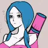
This was a reference to the Carrot/NK scene from Chapter 3, so I copied the color palette pretty much exactly. I still wanted it to seem like "Steve" was just what Besty called the Nightmare Knight and not a completely different character.

After this, the colors shift to include Steve's signature blue. I added the red lights to keep the scene from becoming too one-note.

These were some preliminary sketches for the area. I was going to add a reflection to Besty's speech, but that felt excessive.

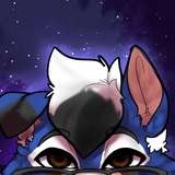
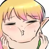
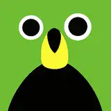
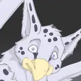
Steve's first appearance. This was the scene where I struggled the most with Besty's see-through speech bubbles. It might have been best to just omit them here, since the margin cutting through is pretty distracting.

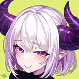
This is an earlier version of Steve. I always meant to design an "opposite" Nightmare Knight, which meant upside-down horns early on, but I eventually decided longer horns would look cooler.

Steve's personality is also meant to mirror the NK's; Steve is openly affectionate with Besty where the Nightmare Knight skirts around showing kindness to the Disaster Masters. (Although, this bit was at the end of an update, so I remember some readers bracing themselves for Steve to say something mean on the next page. Never!)

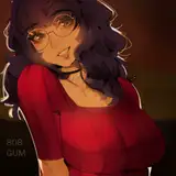
Since this scene is set in a mysterious world of darkness, I got a bit carried away with the, uh, darkness, and struggled against it the whole time. You guessed it: this absolutely would not look good in print.
Part of the issue is that Steve and Besty are already very dark, but I stubbornly didn't want to make the background any lighter so that they'd stand out against it. I ended up falling back on rim lighting, and I'm not satisfied with how it looks.
Let's not talk about how Steve knows what a dollar is.

Despite lacking eyes, Steve isn't completely blind, as is shown here. Also, the introduction of a bright light source immediately made everything easier to paint...this was a persistent weakness of mine.

I got very nostalgic revisiting the room where Cucumber and friends fought Splashmaster in Chapter 1. Looking at this though, I think it would have been nice to change the angle of the ship slightly so it felt a little more three-dimensional.

Steve has kind of the same problem as Rosemaster where it's hard to make them look soft and kind without visible eyes. I tried to accomplish this by making their genuine expressions less intense.

I keep forgetting this end-of-chapter page existed. I had been considering the idea of slowly making the interludes longer and the main chapters shorter, to highlight the "interlude characters" (NK, Parfait, Steve, etc.) getting more focus.

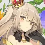
This is one of my favorite pages. I loved getting to write the Nightmare Knight and Cordelia becoming more relaxed with each other.

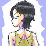
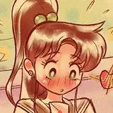
I had been leaning into making Cordelia's expressions more catlike... Looking back, I'm not sure why she (or anyone in this comic) doesn't have a tail. I guess I just wasn't thinking about it.

The third panel here was going to be a wider shot of the Nightmare Knight:

I actually like this more, looking at it now. It feels like a better use of the panel space.

I really like the combination of bright green and deep blue with magenta as an accent color. They don't have any particular significance here; I just think they're neat.

Sketches of Cordelia in her spacesuit. The top right ended up being used for the final panel.

In earlier pages of CQ, I avoided using pure white. I don't even totally remember why! It was probably advice from one of my art teachers that I misconstrued... Anyway, I had fully done away with that habit by this point.
Here's our first proper view of Peridot's room, which is pretty simple and functional. It would make sense for her to have a more extravagant room with a big princess bed and things like that... but frankly, I didn't feel like putting much more detail into it.

The Nightmare Knight having an overblown panic reaction to being called "Steve" was something I had looked forward to.

As mentioned a few times, Pumice was an homage to Sailor Moon, so the city skyline here was based on backgrounds from the anime. If I were doing this now, I might draw more from the manga for things like paneling and onomatopoeia... The "th-thump" in panel 2 here is kind of bland.

This paneling is pretty chaotic, but I guess it doesn't matter that much if you read it a bit out of order.

This was also something I'd looked forward to for a very long time. The tape over the speech bubbles is meant to convey that he's using a voice changer.

Here are some earlier sketches of Pumice NK. I basically wanted him to look like a Power Rangers villain, though a few readers compared him to Zurg from Toy Story for good reason. The lack of star nipples was an act of cowardice on my part.
The reason he has an axe in one of these is because, many years ago, I drew an illustration of the real Nightmare Knight wielding an axe, which he...doesn't, ever. He doesn't have one of those. I just did it because it was cool. So this guy inherited it.

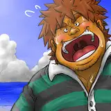
I might have avoided shading throughout this scene because I was short on time, but the flat colors work well on this page. "Cloudmaster's" long nose was actually taken from a very early design for Mistmaster (way back when he actually was named Cloudmaster).

Sketch versions of the Pumice DMs, which I think I posted on Twitter once. Quakemaster didn't end up appearing in this scene because I didn't want this goofy representation to be anyone's first exposure to the character. I'm not sure why he has a mochi pounding hammer.

The "Cloudmaster" bit here could be foreshadowing or self-parody depending on how you choose to look at it.

I thought of all the common nightmares I could. You know, normal stuff. The one near the center is supposed to be "chased by that guy from that one movie," but I decided it wasn't that big of a deal.

I like this page, but the lighting on Pancetta is very washed out, which is too bad... I didn't spend much time on her design here, since she and Pumice wear basically the same costume (like Sailor Scouts).

This could be classified as online slang that already sounds pretty dated today. I try (and sometimes fail) to keep to a personal "no memes" rule when I write, but I figured this was innocuous enough without context.

The slanted margin that makes panel 2 vaguely cone-shaped is something I use a lot when characters are shouting. I've already talked about the general "rule" of angled margins feeling more dynamic, but that can apply to characters just standing around and talking, too.
Also, I love this page! The Nightmare Knight and Peridot were always some of my favorite characters to bounce off each other.

Here's what the thumbnails of my pages looked like around this time, by the way. I think my thumbnails tend to get sloppier the more comfortable I am with what I'm doing. You can see here that most of the final pages were laid out exactly like the thumbnails, even though they're basically stick figures.
That's all for now. See you next time!