Cucumber Quest Retrospective (Chapter 5 - Part 1)
Added 2021-07-01 05:59:50 +0000 UTCWelcome back, and thanks for being here. This is it...the final episode! Well, not quite, but we're almost there.
Since Chapter 5 is the most recent chapter of Cucumber Quest, this retrospective might provide a more up-to-date look at my comic process... But it was still 2+ years ago, and I was suffering from extreme burnout at the time, so I wouldn't say it's my best work. It is what it is, I guess!
Let's do it!

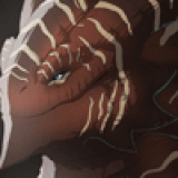
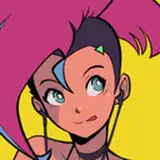
I went for a simpler title page this time, which was effective enough, though I wish the composition had been a bit more carefully considered. You can see the Nightmare Knight's eye on the left there, but I could have positioned it so that it aligned with Quakemaster's mouth in a more satisfying way, and made the rest of the characters' eyes a bit less prominent.

Originally, my plan was for Carrot and Ametrine to set out for Basaltbury in Ametrine's tour bus, along with her band:

It was one of those things that was fun on paper but ultimately not worth the effort. Ametrine's bandmates didn't really fit into the story of the chapter, and I hadn't even designed them yet, so I wasn't too attached.

In a much older Patreon post, I shared some concept art for this chapter. This sketch of the path to Basaltbury was pretty much how I wanted the final area to look, so there weren't many changes. I wanted it to feel like a volcanic area being suppressed by unnatural cold.

The margin width is inconsistent here because I achieved that "cut-in" effect by applying a white outline to the shape of the panel with the "stroke" tool in Photoshop.

In that journal I linked earlier, I posted some concept art for Basaltbury from before it was a tower. Quakemaster was always planned to threaten the people with earthquakes, but it didn't seem that perilous when the city was so sturdy-looking.

I do wish I'd spent more time with Obsidian's design. It's a bit basic, and drew a lot of comparisons to Dimentio from Super Paper Mario--which wasn't really my intent, if you can believe it.

As you can see, I couldn't really decide on how I wanted to arrange the "tails" of his hat, either.
I continued to use "heat suppressed by cold" as the theme for the colors in Ruby's throne room. The red used is a bit pinkish, which eases the transition to purple when Ametrine shows up.

There's an uncanny valley thing happening in the third panel; I got carried away rendering Ametrine's face when simplicity would have worked better.


This is one of my favorite panels, but I'm surprised by how minimal the sketch for it was! I guess the lighting and colors did most of the heavy lifting.

I felt more confident attempting an action scene at this point. It could be more impactful, but it's nice to think about the improvement from Almond "fighting" Tomato in the prologue.

As you might remember from the concept art post, Quakemaster is the one Master whose design I struggled the most with. He was at one point planned to be more reptilian, but only ended up keeping the big tail.
His look was vaguely inspired by Cubist art. I tried to be ambitious with it, but it ended up being kind of a pain to reproduce on each page. Here's a quick overview of the process:

First, I would paint the panel in basically-greyscale.

Next, I added an overlay layer to divide the page into subdivisions.

Then I'd add a gradient map. I started getting a lot of mileage out of those around this time.

Finally, I'd add outlines and a separate layer for painting on additional texture.

Later, I started blocking each page in using actual-greyscale before adding the gradient map. It was a huge timesaver! If I had continued CQ as a comic, I probably would have continued doing this where I could.

These panel subdivisions didn't really follow a set pattern. Generally, I tried to use them to emphasize motion or contrast, working with the composition of the overall page as much as I could.

I think this is one of the better early examples of the effect. The gradient map was black to blue to red to yellow, which made it easy to achieve a cooling-lava look in these panels.

Like every new art style in CQ, it took a little while for me to settle into Quakemaster's, but I think this page was a turning point. I added grey to the palette here, which I guess was meant to be associated with the curse placed on Carrot, but it ties the other colors together well, in my opinion.

In the script, it's written that Obsidian hands Quakemaster his cane, but it's not very prominent here. I think that's good, though; I wanted Obsidian's acts of devotion to be understated.

The Nautilus diary returned, sparing me the trouble of at least 10 set-up pages.

Basaltbury, being contained in a tower, has a central plaza that's basically just a lobby. I wanted it to feel like a ritzy hotel, but it's pretty drab... Some more embellishments would have helped.

Cabernet had been planned for a while, but I'd never found a good time to introduce him in the comic until right before this chapter. The script says "senior," but in my brain, it's "senpai." There's just nothing to be done about that.

I laughed very much when writing these pages. Carrot has special speech bubbles here for dramatic effect, but they don't persist outside of the dream sequence.

The Quakemaster art style had me thinking more about panel subdivisions like this. I think it still looks great! That warm reflected light...well, you know how I feel about that kind of thing already. I could have spent a bit more time polishing the bottom half, though.

Back to these guys. The colors are less fiery here since Quakemaster isn't present, but his influence is still felt.

This is a rough sketch of the back room where Carrot and Ametrine are locked up. As you can see, there was going to be a separate portion of this room where a bunch of statues were hidden. These would have been revealed as other victims of the curse that befell Carrot, but I cut that bit from the story.
I know what you're thinking: "You were burned out and didn't want to draw the extra pages it would have required, right?" Not this time, actually! I felt it would be most appropriate for Carrot to be the only victim because his offense against Quakemaster--claiming he could "never fathom" love--was particularly great.

Early on, Cursed Carrot (TM) was going to stop talking right away, but I really wanted him to be an emotionless edgelord for five seconds.

I had considered keeping Obsidian's normal face even after being "turned into stone," but it felt more threatening if he was no longer recognizable as a normal person. As for how his mask/hat detaches...don't worry about it. It's all illusion magic, so it's fine if it doesn't make sense.

Don't say Cucumber Quest never taught ya earthquake safety!
And that's it for today. Next time...the final episode, actually!
Comments
Reading this makes me want to use gradient maps a bit more in my own art! It might help me with working with minimal color palettes. I can’t wait for the final episode, it’s been one heck of a ride! (Sorry if this comment is a bit sloppy. I’m typing this on my phone since my computer stopped working and I need to get it fixed.)
2021-07-05 06:41:31 +0000 UTCI love the insight into how you designed Quakemaster's "feel," the way each Disaster Master has their own aesthetic is one of my favorite parts about this comic.
2021-07-02 11:54:33 +0000 UTCI love these breakdowns so much. I have to go look up a gradient map now...
Liz B-M
2021-07-01 18:17:03 +0000 UTCGreat post as always! I really appreciate you going into details about what exact photoshop tools you used for different effects.
Laura Knetzger
2021-07-01 15:57:34 +0000 UTC