[Here's a link to our previous installment in this series.]
So, yeahp, I'm serializing my insanely tight layout pages for the 2005 Marvel miniseries Iron Man: Hypervelocity, the first issue of which I wrote and laid out long before an artist had been chosen; of course, the great Brian Denham wound up tackling the art for the project, but I had already rolled with these time-consuming roughs out of, I dunno, sheer perfectionism and unhinged micro-managing.
Either that, or these layouts represented the sum total of artwork I actually wanted to produce for this project. As I've noted here before, cranking out finished artwork is the bane of my g-d existence as an artist; I like (or even occasionally love) drawing loose, relatively spontaneous comic pages like this, but bog down toute suite upon having to painstakingly render my usual tight and precise completed artwork.
Even though we're coming up on the 20th anniversary of Hypervelocity's creation, I am loath to publicly acknowledge to non-Patrons that I'm serializing these layouts here, hence the "Old SF-Adjacent Project" monicker.
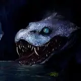
Anyhoo, I struggled with working up roughs for the issue's cover, mostly focusing on Tony Stark 2.0's cyberfoe Absynthe. I liked this first one a fair bit, but my editor didn't:

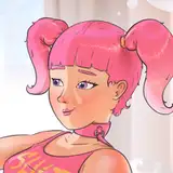
So I tried a series of "scribblier" cover roughs, with Absynthe now wearing the Hypervelocity Iron Man armor:


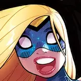
And here's the final rough, taking a very different approach with digital gothgirl Absynthe incarnated as a whole bunch of Avengers:
 Here are the inks by series artist Brian Denham; or I should say digital inks, as he did the entire series' artwork in vector-based graphics program Adobe Illustrator:

I should note that all the amusing text jokes on the piece were supplied by Brian himself; not sure what the "FREE THE WM3" bit on Cap's shield is referencing, alas.
Lastly, here are the final colors by the fine lads of Guru eFX:

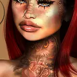
Neat that the logo color reflects the "absinthe green" color riff, BTW. In case you were unaware of said riff here's some absinthe ref images used for the series:


Speaking of which, here's Brian's design for that "absinthe green fairy" tattoo on Cap's shoulder:

'Twas a vector graphic, so he could scale it up or down in Illustrator as needed.
Wellp, I just blew half a g-d hour blithering about Hypervelocity #1's cover art, which is gonna have to do for this installment. Next time around, we'll move on to the interior page layouts, okay?
NEXT TIME ON THIS HERE PATREON: No idea, TBH, but something should be coming up in the next M/W/F slot. Let's find out together, shall we?
Dean Reilly
2024-08-22 09:22:42 +0000 UTC