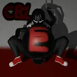
ήΒΥήΓΥήΒτήΒκήΒψΎ╝Β ϊ╗ΛίδηήΒψόΨ░ϋοΠήΒχήΔΞήΓ┐ήΒΝήΒβήΒΡήΒτόΑζήΒΕήΒνήΒΜήΒςήΒΜήΒμήΒθήΒχήΒπήΑΒώΒΟίΟ╗ήΒχήΔεήΔΕύ╡╡Ύ╝ΙύΦ╗ίΔΠ2όηγύδχΎ╝ΚήΓΤύδ┤ήΒΩήΒοήΒ┐ήΓΙήΒΗήΒρήΒΕήΒΗϊ╝ΒύΦ╗ήΒπήΒβΎ╝Β όΚΜύθφήΒτήΓΕήΓΜήΒνήΓΓήΓΛήΒπήΒψήΒΓήΓΛήΒ╛ήΒΩήΒθήΒΝήΑΒόκΙίνΨήΓ╣ήΓψό░┤ήΓΓώδμήΒΩήΒΕήΒςήΒρήΒΕήΒΗήΒΥήΒρήΒτό░ΩήΒξήΒΞήΒ╛ήΒΩήΒθέΑο ήΒ╛ήΒιίχΝόΙΡήΒπήΒψήΒςήΒΠήΑΒώΑΦϊ╕φύ╡╡ήΒπήΒβΎ╝ΙύΦ╗ίΔΠ1όηγύδχΎ╝ΚήΑΓήΒ╛ήΒιϊ╕ΑώΔρήΒχήΔΠήΓνήΔσήΓνήΔΙήΒΝίΖΖίΙΗήΒτίΖξήΒμήΒοήΒςήΒΜήΒμήΒθήΓΛήΑΒϋΓΝήΒχί╜▒ήΒρήΒΜήΓΓϊ╕φώΑΦίΞΛύτψήΒπήΒβήΑΓ ϊ╗ΛίδηήΒχήΔκήΓνήΔ│ήΒχϊ╕╗όΩρήΒρήΒΩήΒοήΒψήΑΒϊ┐ψύη░όπΜίδ│ήΓΤόΠΠήΒΠύ╖┤ύ┐ΤήΒρήΑΒϋΚ▓ίκΩήΓΛήΒχύ╖┤ύ┐ΤήΒπήΒβήΑΓ ώΒΟίΟ╗ήΒχήΔεήΔΕύ╡╡ήΒχήΔσήΔΧήΒΜήΓΚύδ┤ήΒΩήΒοήΒ┐ήΓΙήΒΗήΒρήΒΕήΒΗήΒνήΓΓήΓΛήΒπήΒΕήΒθήΒχήΒπήΒβήΒΝήΑΒώΒΟίΟ╗ύ╡╡ήΒΝύ╡ΡόπΜύΜΓήΒμήΒοήΒΕήΒθήΒχήΒπήΑΒύ╡Ρί▒ΑόεΑίΙζήΒΜήΓΚόΠΠήΒΕήΒοήΒΕήΒ╛ήΒβήΑΓ ήΔεήΔΕύ╡╡ήΓΤϋοΜήΓΜήΒρήΒςήΓΥήΒρήΒςήΒΠίΙΗήΒΜήΓΜήΒΜήΓΓήΒΩήΓΝήΒ╛ήΒδήΓΥήΒΝήΑΒϊ┐ψύη░ήΒμήΒ╜ήΒΕήΒχήΒΜόφμώζλήΒΜήΓΚϋοΜήΒοήΓΜήΒχήΒΜήΒκήΓΘήΒμήΒρίΙΗήΒΜήΓΛήΒτήΒΠήΒΕήΒπήΒβήΑΓήΒΓήΒρήΑΒύΚ╣ήΒτήΔδήΔιήΔσήΒκήΓΔήΓΥήΒχώκΦήΒΝί░ΠήΒΧήΒΠήΒςήΒμήΒοήΒΕήΒοήΑΒίξξήΒτϋκΝήΒμήΒοήΒΕήΓΜήΓΙήΒΗήΒςόΕθήΒαήΒτήΓΓϋοΜήΒΙήΒ╛ήΒβήΑΓήΒΥήΒχήΒρήΒΞήΒψίΠΓϋΑΔύΦ╗ίΔΠήΓΤϋοΜήΒςήΒΝήΓΚήΑΒήΓςήΔςήΓ╕ήΔΛήΔτήΒχήΔζήΔ╝ήΓ║ήΒτήΒΩήΒοήΒΕήΒΥήΒΗήΒρήΒΩήΒθήΓΚύΜΓήΒμήΒοήΒΩήΒ╛ήΒμήΒθήΒρϋογήΒΙήΒοήΒΕήΒ╛ήΒβήΑΓ ϊ╗ΛίδηήΒψώΑΗήΒτίΠΓϋΑΔύΦ╗ίΔΠήΒχϊ╜ΥήΒχίΡΣήΒΞήΒτήΒΩήΒμήΒΜήΓΛίΡΙήΓΠήΒδήΒοόΠΠήΒΕήΒοήΑΒόΚΜήΓΕϋΖΧήΓΤϋΚ▓ήΑΖήΓςήΔςήΓ╕ήΔΛήΔτϋοΒύ┤ιήΓΤίΖξήΓΝήΒοήΒΕήΒ╛ήΒβήΑΓϊ╜ΥίηΜήΓΓϊ╗ΛίδηήΒψί░ΣήΒΩήΔιήΔΒήΔιήΔΒήΒτήΒΩήΒοήΒΕήΒ╛ήΒβήΑΓ ήΒΥήΒχί╛ΝίΟγίκΩήΓΛήΒπϋς┐όΧ┤ήΒΩήΓΙήΒΗήΒρήΓΓϋΑΔήΒΙήΒοήΒΕήΓΜήΒχήΒπήΒβήΒΝήΑΒόφμύδ┤ήΒΥήΒχίκΩήΓΛόΨ╣ήΒπήΒζήΒχήΒ╛ήΒ╛ίκΩήΓΜήΒ╗ήΒΗήΒΝήΒΕήΒΕήΒχήΒΜήΑΒήΒζήΓΝήΒρήΓΓήΓλήΔΜήΔκίκΩήΓΛήΒχήΓΙήΒΗήΒτήΒ╝ήΒΜήΒΩήΓΤόξ╡ίΛδό╕δήΓΚήΒΩήΒοϊ╕ΦήΒνήΒ┤ήΒκήΔΗήΓτήΒτϋοΜήΒδήΓΜήΒ╗ήΒΗήΒΝήΒΕήΒΕήΒχήΒΜήΒπϋ┐╖ήΒμήΒοήΒΕήΒ╛ήΒβήΑΓήΒ╝ήΒΜήΒΩήΓΤίΖξήΓΝήΒοϊ╕ΒίψπήΒτίκΩήΓΜήΒχήΓΓήΒΕήΒΕήΒχήΒπήΒβήΒΝήΑΒήΒσήΒΗήΒΩήΒοήΓΓόΚΜόΧ░ήΒΝίνγήΒΠήΒςήΓΛώδμήΒΩήΒΠήΒςήΓΜήΒχήΒπήΑΒύ░κύΧξίΝΨήΒΩήΒθήΒΕήΒρήΒΕήΒΗό░ΩόΝΒήΒκήΒψίΘ║ήΒοήΒΩήΒ╛ήΒΕήΒ╛ήΒβήΒφήΑΓό╝τύΦ╗ήΒιήΒρί░γόδ┤όΚΜόΧ░ό╕δήΓΚήΒβήΒ╗ήΒΗήΒΝήΒΕήΒΕήΒπήΒβήΒΩήΒφήΑΓ ήΓΓήΒΩήΒΜήΒΩήΒθήΓΚί╖χίΙΗήΒρήΒΕήΒΗήΓΠήΒΣήΒπήΒψήΒΓήΓΛήΒ╛ήΒδήΓΥήΒΝήΑΒήΓλήΔΜήΔκίκΩήΓΛήΒχίΙξήΔΡήΔ╝ήΓ╕ήΔπήΔ│ήΓΓήΒΥήΒχί╛ΝόΠΠήΒΠήΒΜήΓΓήΒΩήΓΝήΒ╛ήΒδήΓΥήΑΓήΓΕήΒψήΓΛήΓΓήΒΗί░ΣήΒΩύιΦύσ╢ήΒΝί┐ΖϋοΒήΒζήΒΗήΒπήΒβήΑΓ ήΒκήΒςήΒ┐ήΒτήΑΒ3όηγύδχήΒψήΔεήΔΕύ╡╡ήΒχί╛ΝήΑΒύδ┤ήΒΩήΒθήΔΡήΔ╝ήΓ╕ήΔπήΔ│ήΒπήΒβήΒΝήΑΒύ╡ΡόηεύγΕήΒτύθ│ύι┤ήΔσήΔΨήΔσήΔΨίνσώσγόΜ│ήΒτήΒςήΒμήΒοήΒΩήΒ╛ήΒμήΒθήΓΕήΒνήΒπήΒβήΒφήΑΓ Hi, I couldn't think of any new ideas right away, so I decided to try revising a scrapped drawing I made in the past (second image). I was planning to keep it quick, but I realized that swimsuits are surprisingly difficult... It's not finished yet, it's just a work in progress (first image). Some of the highlights aren't fully applied, and the skin shadows are still incomplete. The main purpose of this drawing is to practice drawing bird's-eye views and coloring. I intended to try revising a rough draft of a scrapped drawing, but the old drawing was quite off, so I ended up starting from scratch. You might be able to tell from the scrapped drawing, but it's a little hard to tell whether it's a bird's-eye view or a front-on view. Also, Pyra's face in particular looks smaller and like it's receding into the background. I remember trying to make an original pose while looking at the reference image, but it ended up being wrong. This time, I've done the opposite, drawing the body exactly to match the orientation of the reference image, and adding various original elements to the hands and arms. I've made the body shape a little plumper this time. I'm thinking of adjusting it with thicker paint later, but to be honest I'm not sure whether it's better to continue painting it this way, or to reduce the blurring as much as possible and make it look more shiny, like anime painting. Blurring and painting is fine, but it inevitably requires more steps and is more difficult, so I can't help but feel like I want to simplify it. With manga it's even better to reduce the number of steps. I might draw another version with anime painting later. I think I need to do a little more research after all. By the way, the third picture is a revised version after the rejected drawing, and it's the one that ended up being like the pose in G Gundam. έΑ╗ύθ│ύι┤ήΔσήΔΨήΔσήΔΨίνσώσγόΜ│ήΓΤϋΜ▒ϋςηήΒτίνΚόΠδήΒΩήΒθήΓΚ"Ishiba Love Love Tenkyoken"ήΒτήΒςήΓΛήΒ╛ήΒΩήΒθ(┬┤╬╡Ύ╜ΑΎ╝δ)Ύ╜│Ύ╜░Ύ╛ζέΑο