ART: Designing New Opaldune HUD (Part 1)
Added 2024-02-18 13:26:00 +0000 UTCWe’ve been running on a temporary UI all this while, cobbled together by necessity, and it was always in the plan to reskin it. After working on this for quite a while, it’s finally(!!) time to share it with you. :-)
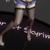
Some explorations of what it could look like :


Each version built on the last, and we combined the things we liked for each round.
Some design considerations we kept in mind when coming up with the visuals :
- Opaldune has no pause function. It continues playing even when popups are opened on screen, and enemies can attack you at any time.
- Due to this, the player has to be on alert for danger at all times. We chose to keep the center of the screen free, anchoring any pop ups to the sides, and to use transparent or translucent screens when possible to allow the player to see behind whatever popups are opened. The only full-screen screens are the Save and Load Screen, as we expect players to only open them in the Safe Rooms, where they don't have to worry about things blocking their view.
- We expect most environments to be dark, so whatever we come up with needs to be easily readable against a dark background.
- We tried to keep everything else minimal, only displaying what was necessary.
What do you think? (There are some ideas here that look very nice, but we decided we couldn’t use.)
Let us know what you’d like to hear about. In the next post, we’ll share which ones we chose, and why we didn’t go with some of the other options.
Till next time,
Saturne