Hey!
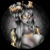
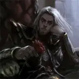
Hope you're all well! I wanted to share with you a small piece I did to play with the grayscale approach I used to have while working in Photoshop. This was more or less a test to see if I could apply this same look to concept art without it looking out of place. I think this works well for what it is and I've seen a ton of artists use this approach successfully in their client work but I tend not to use it too much. That being said, it is always a great way to knock something out quickly with nice results. I'd suggest checking out the PSD so that you can see how each step of the process works layer by layer.
Anyway, just something quick that I thought may be of some help or interest! Feel free to eat it!
Thanks as always for your support!
Dave
Andrés Aponte
2021-03-25 18:52:28 +0000 UTCFaolan Grady
2021-03-25 04:42:07 +0000 UTC