Here's a tutorial on how to do these realistic looking blurred backgrounds. Some asked me how to do it which gave me the idea to make a quick tutorial out of it. I really hope you understand how I mean the side notes on each slide.
Step 1: Be sure what do you want to have in the end. A good sketch is the base which hold everything together. Make quick guidelines. I suggest a 1 point perspective for the start to make things easier. Draw in your buildings, trees, whatever you want as a background.
Step 2: Main Colors. First of all, look for a photo which represents your plan the most. Try to take the main colors of the reference. And then try to create depth with light and shadows. Again, reference is key! Keep it simple for now. Just some main shadows to create an easier readability.
Step 3: To make things 'realistic' we need more than just base colors of course. Now I just paint in different HUEs and try to blend them. I just move the HUE slider back and forth to create interesting colors and surfaces. PLUS DETAILS: As I showed in the example photo our eyes/brain reads certain stuff as "details" even if an image is blurred. That is created by small color/shape shifts. Our brain is like "Ok this pink blop must be an object laying on the ground or this yellow spot on the wall must be a flyer or something.
Step 4 Blurring/Step 5: After blurring the image I compare it with the reference and see if I can do more to make it feel more real. So here I just added more blobs and shapes with a smaller brush size. It's a good contrast to all those bigger shapes. Next I increased the shadow by simply adding more light in the middle and a little on the walls on the side which would reflec the light.
Step 6: Now that I'm happy with all the blurred image I bring the foreground back in by adding sharper shapes with the lasso tool and bigger brush strokes with a textured brush. Drew in the lines of the ground "plates"..dont know what they're called lol. And a little more grain and smaller shapes here and there. And thats's it basically :)
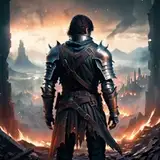
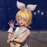
Step 7: Put your character in place, make some color corrections so the whole image looks harmonious. The wrong colors on the character could throw everything off so you can add a color balance layer on top or you can merge everything and edit the colors with the 'camera raw' tool if you have photoshop :)
That's it :) Hope you could take something out of this. Let me know if it helped and what I could do better in the future. Your feedback is always appreciated.
Stay sticky! ❤️
DORN
2025-01-27 21:46:07 +0000 UTCThe Assman
2025-01-27 21:14:32 +0000 UTCLee
2025-01-26 17:32:50 +0000 UTCDORN
2025-01-26 17:30:00 +0000 UTCLee
2025-01-26 17:15:16 +0000 UTC