I guess this needs to be posted as it is since it's the end of the month already, even though there's not as much actual horny content as I'd like to have for a proper pixel art post.
As I said in a previous post, working on this NES project got me too consumed so I couldn't focus properly on more urgent art plans like Pride Month art sequence. Every day I think "Alright, today I'll dedicate my entire time to drawing", then I say "Well, maybe start with a little bit pixel art first, just a quick warm up." and then this "warm up" takes almost my entire day time.
Besides of drawing, I got busy with learning different stuff again. This time all the studies are NES related of course, mainly directed towards getting a better understanding of what I can do and what I can't if I seriously wanna work on a game for real.
I'll try to be as short as possible to not overload you with boring things that don't have much direct relation to art content.
I finally saw the actual limits of how much stuff I'm allowed to put in a game project if I really want it to be NES-authentic and programmable without cutting half of my ambitions which is very important for me.
Before I figured it out I had to anxiously play NES games with opened tile viewer and save every game's full set of tilesets in hopes to see that their number is comparable to what I have in mind for my project. Blind guessing is not my favorite method, not to mention that the games I played didn't seem to have as many tilesets as I'd like to have for my own project so it wasn't very reassuring anyway until I found real answers.
Putting it simply, most NES games had their data stored in two formats, PRG and CHR.
CHR (Character) is all the graphics data stored as sheets I call tilesets just for convenience, in NES terminology these are "chr pages".
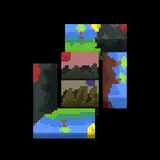
This is an example of one such chr page, I already told you about 256 unique tile limit and this is the actual size of one such chr page. It can be used for either backgrounds or sprites.
PRG (Program) is everything else, the game's code determining how everything functions, including music as well.
Some NES games have only PRG data without graphics stored as CHR banks, I don't know how it's done but many games had it that way, classic Battletoads or 4 Mega Man games out of 6 for example.
Both PRG and CHR banks had fixed capacity sizes which increased throughout NES lifespan
8, 16, 32, 64, 128, 256, 512 and 1024kb
You see, each expansion is exactly two times bigger than the previous.
In early years of NES history when games used very basic setup without any extra expansion chips, games like first Super Mario Bros were about just 40kb each. But obviously it doesn't really matter since we're talking about much more complex project.
Later 256kb became the most common size standard for NES games, about 700 games out of 1500 officially released ones including a majority of golden NES classics were that big.
In these games, 256kb was shared equally between PRG and CHR, each receiving 128kb. So, how much is it you ask? Well, one full CHR page of 256 tiles is 4kb, divide 128 by 4 and you get 32 full pages like the one shown above. Usually games used about 20-25 of them for background graphics which includes level assets, menu and cutscenes graphics and so on, the rest was given to sprites and sprites always require a lot of graphics, animations eat them up pretty quickly.
My project already can't fit this golden standard, by my estimations only background graphics require 32 full sheets without any sprites.
But my situation is not hopeless at all. About 150 official NES games had expanded graphics going way beyond these limits and there's a plenty of classics among them, like several parts of Mega Man, Super Mario Bros 3, Kirby's Adventure, two parts of Flintstones and many more great games. Usually they used CHR expanded to 256kb which gives you whooping 64 chr pages instead of 32 which is MORE than enough for my ideas. So, I could finally have a sigh of relief and be sure that a game like this is actually comparable to real NES classics and can be programmed for a real hardware without cutting my ambitions dramatically.
I was also discussing it all with my bf all the time as well, he is eager to start learning Assembly 6502 language required for making NES games once his long drawn business trip is over and he can finally get back to Moscow and arrange my fateful moving so we can start living and working together. Finding more ways to be more useful in this project and overload the coder with extra work as less as possible was also a part of my studies and I actually succeeded at digging this topic a lot as well.
What really proved that my help on making not just graphics but also level layout can be really useful is another NES graphics tool called NEXXT which I had installed long ago but got intimidated by its more complicated interface and just decided to stick with NAW but few days ago I realized that it's much easier to work with than I thought. And what makes it drastically different from NAW is that it allows to work with not only just one single screen but a whole chain of screens. In other words, you can expand the canvas as much as you want and create a full layout of the level. And most importantly, it has the option to export the entire canvas directly in .asm format which is Assembly code so it left me with zero doubt that if I decide to create a level layout it will be way more useful than just drawing a plan and then having the coder to do it all from scratch in code, technically I'll be making coder's work for them here.
It also allows you to set collisions, this means you can define it in an easy convenient way which tiles should be solid, slippery, slow down or hurt the player instead of the coder doing it all manually. Pretty nifty for just a graphical tool, all these discoveries proved that my role as a NES game designer can be WAY bigger than I imagined and it's very exciting to know.
But now let's talk about what actually was done so far. 

Snack world asset page got largely updated as you can see and now looks way more complete with more background elements and new enemies. I also made a new sheet of assets for Sweets World, this one was done pretty quickly unlike more troublesome Snacks World, I was really on fire and did it all in one sitting, working for almost 7 hours straight.
Speaking of enemies, I did a lot of new ones as well. Now they're not scattered all over level asset pages, I gathered them together on a separate sheet just to make it more convenient so I can see that everything is balanced and each world gets an equal amount of enemies. Green zone on the bottom is for uniform enemies which are not thematically related to any world and can appear anywhere. Empty white zone is prepared for the final world which I didn't start working on yet.
Another big update is that I created hub world maps for every each world. Currently I cut it to 5 worlds plus the final 6th world which suddenly opens after first 5 worlds are finished as the final culmination. Not sure if I add more worlds, it will depend on how much graphical memory I'll have left and I'll be able to see it only in the end when I get to the actual development stage.
The last world can be simply called "Fat World", white stuff the most of its surface is made of is supposed to be lard and you can see there's sticks of butter, eggs, chicken legs and slices of greasy pizza, I had a funny idea to call that boiling butter river stage "Styx of Butter", you know, like sticks of butter but it's river Styx from Greek mythology.  The concept of world hubs is pretty common in old games but I'd say the main sources of inspiration for me were Mc Kids and Super Mario Bros 3. The idea came to me when I thought that, instead of making each world consist of just 2 levels, their tilesets can be used more efficiently by stretching them over several levels. But a complex game world system like this requires a more complex level select system than just one screen like in Duck Tales and so I thought it needs hub screens for each world. However, it shouldn't be memory wasteful so I tried to keep world hub tileset as minimal as possible. As a result, I managed to fit 5 world hubs in just one tileset! 6th one just can't fit no matter how much I cut everything so I had to spare another page for it, this is still a pretty good achievement.
These are all the updates on this project. A lot was done already but there's a plenty more work ahead. I still need to draw all the assets for the final world, its boss and also bosses for Asian Food World and Sweets World. I already have good ideas for all 3, just need time to let it out. And there's a plenty of side stuff, last weight gain stage image for Zed, remaining enemy sprites, title screen art, intro cutscenes, world select screen, pause menu design, game over screen and ending scenes. Although it's all easier things, level assets are the hardest part because you need to think about game logic while making them, title screen art, cutscenes and so on in the other hand are just pretty pictures.
But, as you can already tell by what was actually posted, it's not over yet, oh no. I got REALLY sidetracked by just a single random urge, just as usual. I decided to revisit my first sprite ideas, if you remember my first NES experiments you'll remember that I made little Zed sprite long time ago, way before I did sprites for Mark. It was cute and nice in terms of being memory saving as it's not too big but obviously it lacked detail so I decided to try make a more detailed character comparable to bigger NES sprites where Zed's features would be more refined, just for fun. The final result was so good it got me very carried away.
The thing is, I already had fantasies about NES game with my OCs and of course it was Zed since he is my main OC, Mark sprites weren't drawn yet and I didn't have any thoughts about food themed project but these fantasies were very brief and random. I was thinking about a game with very immature humor similar to Boogerman but more phallic rather than toilet humor-themed, although not completely devoid of it either, something with a silly name "Zed's Tricky Dicky Adventures" and no less silly premise where Zed falls asleep while reading dirty magazines and sees weird dreams where he travels through different worlds with everything shaped like a dick. I didn't ponder this idea much, just imagined few worlds and what exactly can be dick shaped in them but didn't treat it really seriously.
However, this sprite somehow made me remember about these ideas again and how I thought to implement toilet humor through raunchy game mechanics with gas attacks and so on and I started drawing sprite animations for Zed one after another. As a result, you can see I did a lot of frames for Zed's walk cycle, fart attack, belch attack, piss attack, crouching, fart floating, death animation and also special modes for flaming farts and freezing farts. I hope it's okay that I'm posting it openly, I think the fart stuff is too humorous in a Boogerman way here to actually disturb anyone.
Death animation was partially inspired by Adventure Island. I just thought it's funny how the character loses all his clothes when he gets killed by fire or icicles and covers his crotch, pretty explicit humor for Nintendo with all its policies, so I thought why not do something similar but way more bold.
 And then I decided to try out making some level assets, "just to have some fun with it", and as a result I ended up "having fun" working on these assets for three days.
 I was thinking that this time it can be done in a style of more late NES games when it became pretty common for them to look dark and noir with black color being used very heavily and efficiently as both the color of the background and the color of objects shading which made it look like everything is kinda emerging from the darkness.
I'll try to explain in simple words why this method was so benificial and became the leading style of NES. 
Look at these two sets of background palettes. Left is the set of palettes I picked for the fast food world levels from my main current project, right one is what I used for these new assets.
Pink is the fixed color used by background, it's barely used as a part of objects shading.
Black is fixed for every palette as well because I choose cartoony style where thick outlines are required and just in general it's logical that background elements should stand out somehow.
This way I'm left with only two free interchangeable colors for each palette which doesn't allow to use really complex realistic shading. Usually it just makes me desperate to rather use it for two completely different colors instead of two close tones which could work together for shading, like red-green one which I picked for burger parts with tomato and salads, it was much more important than adding shading.
Now look at the right set. Black is already a background color and the color of object outlines and shadows, this way I get THREE free interchangeable colors for each palette that can be used for shading PLUS black. Now you see why this style was so loved and why it's so much easier to use for NES graphics. No other color feels as natural in this role as black. Only maybe some darkest tones from NES palette but it will be a bit tougher to pull out naturally looking graphics this way.
Drawing these things was too much fun after working on my more cartoony project where deliberate refusal of too much black made it hard to use complex shading and I really let all my enthusiasm out, almost made a full sheet of all possible assets for this particular level idea.
I don't know why I started with cybernetic sci-fi aesthetics, I guess it's just too common in NES games and very fitting for video game level design in general with too many things you can imagine.
I even went an extra mile and exported all my concepts in NAW to make some showcase samples of level layout that I can text on emulator with TV filters.

It was actually very useful because initially I messed up the shading on robotic cock poles, you can see how black lines of shading and thin lines of highlights just doesn't work right and rather break this cylindrical shape on several small cylinders with black looking more like negative space between them. The way CRT effect blurs the dithering really shows if it works or not.
Enemy ideas are way less innocent and more naughty compared to my main project as you can see, there's cock cannons, slime dog monsters which stick their upper or lower parts from pipes (in theory, to belch and fart at you) and crazy scientists which turn out to be flashers and also through test tubes at you. You know, classic sci-fi stuff.
 Here's project screenshots just in case. And don't mind NAW's colors looking so different, it has a weird choice of NES colors with darkest cyan looking very different, I prefer to use Mesen emulator palette as the most natural for my preference.
Last screen with giant robots was a very good testament of how much you can do with so little when using this noir style. I created about 20 extra tiles for them and reused a plenty of solid and dotted lines from other background elements, you can see how the bodies are drawn with just thin highlights and yet they look so real and volumetric!
That's pretty much all I wanted to share for now. I think I'm pretty much over the stage of learning and figured out almost everything I currently need to know about NES and related graphic tools to work with it 100% freely and know that it's all doable in a real game. I'm sorry for being too obsessed with it lately, it's just hard to control my urges, I hope some of you enjoy these concepts no matter how far they're from becoming an actual game and how much less horny they're compared to my regular content.
Bazil Racoondog
2025-07-10 20:20:43 +0000 UTCColly
2025-07-05 00:48:05 +0000 UTCCap
2025-07-02 22:10:39 +0000 UTC