Now it's finally the time to post all the pixel art I did in July. As I already said, I made really a lot of it, I just wanted to make a post only after finishing my commission artwork which took me much longer than I expected.
As usual, it's another big set of assets and for now I keep pushing it further with that Tricky Dicky Adventures idea I made my previous cyber-themed assets for instead of my main project, now there's no way to deny the fact this idea got me really sidetracked. But I'm gonna return to what I should work on of course, having fun with that more elaborate NES style was just way too exciting.
First I need to tell about one thing I learned which is called graphic banks, this discovery slightly affected the way I'm doing and arranging NES level graphics now.
Graphic banks are simply smaller chunks of graphics which you form full graphic pages with.
As you already know by my last posts, NES graphic pages (tilesets) are 128x128px images that can contain 256 unique tiles maximum.
Graphic banks (or chr banks for short) can contain 128 or 64 tiles, hence why they're called half banks and quarter banks. Their other more technical names are 2kb banks and 1kb banks since one full tileset is 4kb.
The purpose of banks is to switch just certain portions of graphics you have on screen for more flexible changes.
And what does it allow you to do?
Imagine if you wanna put more than just one full sheet of graphics in your level but not too much. That's where bank switching comes in handy.

Take these two chr pages of a Star Man stage from Mega Man 5 for example. You can see their top halves being identical and containing more simple assets which form all the basic surfaces and walls which are common for entire level. Bottom halves contain more unique looking elements like this parabolic antenna which appear only in the very beginning of the level.
As you can see, it takes almost the entire half of the tileset so it would be quite a waste but at certain point the game switches the bottom bank to a different one with new graphics. Mega Man used this feature A LOT and as a result, a majority of its levels use 1.5 tileset instead of 1 or 2.
In fact, I already tried to emulate this method of graphics arranging when I did those cyber-themed assets from a previous post, I didn't know about graphic banks yet but I already saw that many games like Mega Man switched half of the level assets and it wasn't difficult to comprehend even without knowing all the technical details and it was fun to work with graphics with even more logical thinking put into it. But after I read about graphic banks I got even more serious drawing graphics with chr bank idea in mind.
As a result, my level tilesets look like this (Horror ones are still not complete so I didn't put them here)
You can see how mushroom cave ones use the same top half as the forest with the same ground tiles, certain mushrooms and tree branch graphics being used by some new tiny mushrooms, that's what I meant by chr banks being very useful for efficient graphics usage.
Now, going more straight to the topic, I did three new level assets sheets, well, more like 3.5, plus some other minor stuff in progress.
 First of all I thought about forest with some suggestive looking trees and mushrooms, it was actually the first idea I came up with for a dick-focused game idea long time ago as it all started when I saw some mushrooms in one bootleg NES game and thought they look too weird in a lewd way. For now there's only one full sheet but there's gonna be another one with bottom bank for swamp graphics and mushroom cave entrance.
Mushroom cave continues the idea of phallic mushrooms in a forest, kinda like the core of this fungal infestation. Believe it or not but pretty much all of these mushrooms are based off real mushrooms with just very little alterations to make their look even more suggestive than it is, mostly mushrooms from Phallaceae family (the name speaks for itself) which are all really crazy, suggestively shaped and look like some alien creatures. As I already said, the cave uses the same top chr bank as the forest so it's a good way to save on materials.
 Next was the alien planet, call it planet Youranus or whatever. That's where I let my imagination go wild, sci-fi aesthetics are very convenient in that regard, you can straight up do dicks growing from the ground, ballsacks hanging down the trees or put nipples on mountains and just say that these are some random alien life forms. Nature can be very suggestive looking at times so it's a good excuse. Mushroom theme was still a bit more limiting at what shapes and colors I can use but sci-fi aesthetic was so fun to work with. I love the dick constellation especially.
 The last level asset sheet I currently did is for the horror themed level, very much Castlevania inspired. It was a bit tougher to deal with, horror aesthetics turned out to be not very ripe for really imposing suggestive and phallic shapes so basic depictions such as statues and paintings became my main life savers.
This level design is a bit peculiar since it uses more unusual approach to graphics compared to my previous stuff and how NES games do graphics in general as well.
 The thing is, NES palette is a bit more technical than just "a set of 52 colors". In fact, NES has 12 colors commonly represented as 12 columns and 4 luma values for each represented in 4 rows, plus black-white-gray of course. Normally if you want your graphics to stick out really good you better just use colors from different rows in your 4-color palettes because same row colors don't go well with each other and their difference is barely noticeable, it just creates a dissonance, especially if you're trying to do shape shading with them.
However, there's some exceptions. Despite being separated on 4 brightness groups, the level of brightness inside each group is still not even either.
 It's easy to prove by turning the palette into grayscale. It's partially because colors from different parts of the color spectrum have different level of luminance, not to mention that colors in NES palette have different saturation as well which affects it too. This way, SOME colors from the same row still can be put together for more nuance results, the difference will be very subtle but if you actually want something less contrasted and more grim then it's a good idea to consider.
 I didn't much explore NES games in order to see examples of such unconventional color combinations but I spotted one in Battletoads & Double Dragon. One of the levels combines darkest magenta and darkest red from the top row of luminance in some places, it looks unusual but not really off-putting.
As for me, I found darkest yellow (which almost looks like swamp green), darkest cyan and gray one of the best dirty grim palettes and used it a lot in this horror setting as you can see.
This sheet still needs a bit more polishing and more details to use chr banks to their maximum capacity so for now I haven't made any level layout samples.
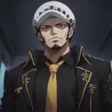
 However, what I did is the boss design for this level which is the first boss idea for this project. All this time I tried to hold myself back at least from doing any enemy/boss designs for this project to not get completely carried away but the idea of an exhibitionist furry Dracula flashing you was too hard to resist.
The big face was actually just the first version, when I started drawing the body I realized it won't fit the screen fully so I had to scale it down but the face turned out way too good so I decided to keep it, maybe as something that can be imagined as the first phase of the boss.

It's a very memory saving design too. Even with both the caped and exposed state, additional tiles for the cape waving animation and the big face it takes only 237 tiles out of 256, excluding the face cuts it down to just 199 which is very nice.
 I also did just a little bit of assets for the planned Wild West level with horny furry totems. The second set with big totems is still a bit raw, needs some details refined and I didn't make up my mind about the colors yet, they're very random for now but the smaller totems seem complete for me.
It's hard to emulate the original colorfulness of American totems when you can use only one 4-color palette in each 16x16px square and have to choose between having more nuance tones for shading and more colors. I think it would be much easier to do if the totems were used for some more cartoony and flat project like my main one where shading is not that important.

Another little thing I did is a quick recreation of BR Games logo as a NES rom. I already posted my attempt to recreate the same logo in different types of 8-bit graphics long long time ago but this time I decided to add Zed portrait, making him a mascot of some sort. I used my very first pixel art depiction of him, scaled down of course.
 Originally Zed's portrait is pretty colorful and cannot be done in basic NES colors without additional tricks so I used some sprite overlaying to add darker muzzle the way it should look, eyes, a bit of his teeth and collar. Pictures show how it looks without sprite overlay, thankfully BR Games logo uses a lot of colors which Zed needs as well so adding the missing colors with sprites is not an impossible task, at least with this particular picture. Keep in mind, NES can't line up more than eight 8x8px sprites on one horizontal line and his muzzle took 7 so I was pretty close to hitting the limit. It just felt important to depict Zed in his original colors on NES at least for once.
That's all my progress with Tricky Dicky Adventures and I wish I could say that's all I did but one friend of mine made my stupid brain distracted with yet ANOTHER game idea after some brainstorming we had.
I really hate having my mind all over the place, it's embarrassing since it's very unprofessional compared to being focused on one idea so eventually I drew the line and put this idea away but still I made just few things to pin down this idea for the future with some visualization.
So, I was sharing my progress with him and using the same picture I used in a previous post here I explained the difference between more colorful and more noir NES style where the latter has way more freedom for more realistic shading, he misunderstood me a little and thought I'm gonna do the rest of my food themed project this way after that discovery.
I explained that I was aware of the noir style long before starting my project and picked more cartoony style with limited shading deliberately so it's not like I was struck with this discovery all of a sudden halfway through the project and then decided to change my approach. These are two separate unrelated projects, each with their own style, making the rest of the first one in a completely different more realistic style would just look tasteless since such visuals just won't match each other.
And when I said that I asked myself a question "Well, why not actually? If I work around this idea, find a good conceptual excuse for it and deliberately make it an intended aesthetic then it can look pretty interesting actually." And so I started discussing it with him.
The first "conceptual excuse" for such a contrast between realism and cartooniness which came to mind is stuff like Roger Rabbit and Cool World, you know, a setting where our real world coexists with cartoon world. It's a contrast I always loved but it wasn't executed very well in videogames, especially on 8-bit consoles where realism is already a tough task in itself but not impossible in my opinion.

Roger Rabbit on NES actually did a good attempt at nailing this contrast, at least it's noticeable that they tried but it wasn't as perfect as I'd like to see it. Yeah, the real world uses more earthly gray shades (at least sometimes) but still it all looks equally flat and stylized. First, because it was a VERY small 128kb game from an earlier era of NES games (Batman Returns for example was 384kb) so it just couldn't waste much data on elaborate graphics, and second, it's an LJN game so it was pretty much cursed from the start. If you're a fan of AVGN or just retro game history you probably know that LJN was terribly infamous for making some of the worst NES games, especially movie adaptations. What I was thinking of is the contrast between something as flat and bright as my main project and something as real and colorless as NES Batman for example. In fact, the contrast could be boosted to even more striking with cartoony graphics being even more flat, my food themed project still has some shading attempts which can be stripped off as well to make it even more flat, and real world can be even more real with VERY monochromatic graphics.
 And even if that's not enough, the contrast can be highlighted even better by using realistic cutscenes which NES was pretty good at in the end of its lifespan. Just look at these almost photorealistic portraits, it's unbelievable that it's still an 8-bit NES but that's what it is. Just imagine a realistic male like this being fucked by a toon and you get a perfect Roger Rabbit-esque NES game. And it's not that hard to do, it's just a question of distributing graphics data wisely.
Another problem why it wasn't done back then is that commercial NES games were afraid of such weird experiments, if the console was capable of being pushed to the limit they preferred to push it instead of deliberately using worse and more primitive graphics. So, toon x real idea felt a bit risky for marketing I suppose. Developers became much more confident with experimenting only in a 16-bit era. All these awesome NES games with excellent graphics and realistic cutscenes became common only by the very end of NES lifespan when it had to do its best to compete with already existing 16-bit consoles, its life was really holding on good faith so it wasn't the best time for risky experiments. Nowadays, when console gaming is mainly in hands of independent developers who treat their work more as a passion hobby and the development process itself became more easily accessible, such experiments are way more feasible.
 I actually did very quick and sloppy attempt at digitizing a real photo to make it fit NES graphics (first picture shows the imagine in comparsion to NES screen resolution and second is to show how the palettes are distributed)
I'm not that good at realistic drawing so I think it would be wiser to rely on photo digitizing. I didn't polish it much, just used an automatic posterizing filter and then did a tiny bit of tinkering with adjusting it to NES palette rules and still the results already look quite impressive! Imagine how much can be done with it.
In fact, I don't think that all of these images were fully hand drawn from scratch, I believe that by a certain point there already existed certain techniques for digitizing an image and using it in a game, like maybe they took a photo, compressed it and then just did some tweaks here and there to polish all the small details which were lost during compression and of course adjust it to NES palettes.

This picture with Terminator is the most suspicious. The dithering pattern is too perfect and looks like an automatic algorithm while his hairline and the line around his lip on the left looks silly like it was just drawn over a photo with a line tool in MS Paint. Not that it looks really bad but it's just too obvious.
And so, I got determined to find out how much realistic a human sprite can be compared to a toon and after some experimenting I did a pretty nice sprite which indeed has a very nice contrast next to my characters. As you can see, he went a long transformation with his head shape and size changing several times until it got much less square and much smaller to make body proportions look less stylized and as real as possible while his face still keeping a handsome look with distinctive facial features. The close up on the right shows my final decision.
 The last thing I did for this concept is taking a quick look how far I can go with making graphics look as rough, flat and cartoony as possible, even rougher than my main project. The results were quite satisfying, I always thought it's hard to fit dynamic edgy shapes into NES graphics where everything is blocky and restricted to a straight grid in a desperate attempt to save on data as much as possible and thus fit more materials but it's actually a bit more flexible than I imagined.
 A couple of emulator tests
 I also got a bit carried away doing different signs, trying to differentiate them as much as I can while using the least amount of graphics as possible. I did pretty well actually, fitting so many signs in just one half of a tileset is a nice achievement.
Some of them are hard to read with CRT effect but who cares, it's not that important and tiny text like that was a common thing back then.
 I drew the line after recreating Kit's Night Club, a veeeeeeery old concept I did during the period when I was very excited about C64 graphics. I tried to stay within the limit of 128 tiles (one half bank) and it was pretty tough, had to drop some dynamic diagonals to save on graphics sadly. After this I said enough and decided to not touch this game concept until I deal with the main projects.
Phew, that was A LOT, just as usual. A whole month of intense pixel art work summed up in one month, I really should get back to making smaller but more frequent posts.
Again, I deeply apologize for being focused mainly on nothing but pixel art in July and not providing you with any actual horny content, even though all my game concepts are always somewhat sexual I understand it's still nowhere near the stuff I usually draw that you can actually jerk off too, I understand that oldschool pixel art is pretty much an acquired taste, some of my subscribers enjoy it a lot while others subscribe to me not to see this stuff all the time but I just couldn't help myself. July was a rough month and as I said pixel art is my therapy, my comfort thing, the only one I can do when I feel bad and low. I have very little self control lately but hopefully it's gonna get back to normal soon.
P. S. Every level layout sample image has a CRT TV filter version as well, I just decided to not upload it to the post gallery since it's already way too bloated, the full archive with both clean and filtered versions can be downloaded below along with nes roms for all the images.
Bazil Racoondog
2025-08-08 23:28:59 +0000 UTCtredain
2025-08-08 05:21:26 +0000 UTCBazil Racoondog
2025-08-05 17:34:52 +0000 UTCRexLioness
2025-08-05 15:14:36 +0000 UTC